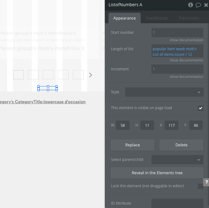
On the image element there is an option to make the image keep proportions when page is resized…if your image is currently fixed width, remove that and make it not fixed width to access the option to keep proportions when page is resized.
The group that contains the image should change its height in accordance with the image element.
Here is a video of a fully responsive RG
The fully responsive aspect of it is not just down to the image option for keep proportions when page is stretched, however, in your RG it should do what you want in terms of changing the height of the grey box and therefore bring up the text elements and overall change the height of the RG cells.
Maybe from the RG itself or a group inside. I took a look during half an hour and I didn’t find. Do you have an idea ? Maybe I can share you my app in PM ?
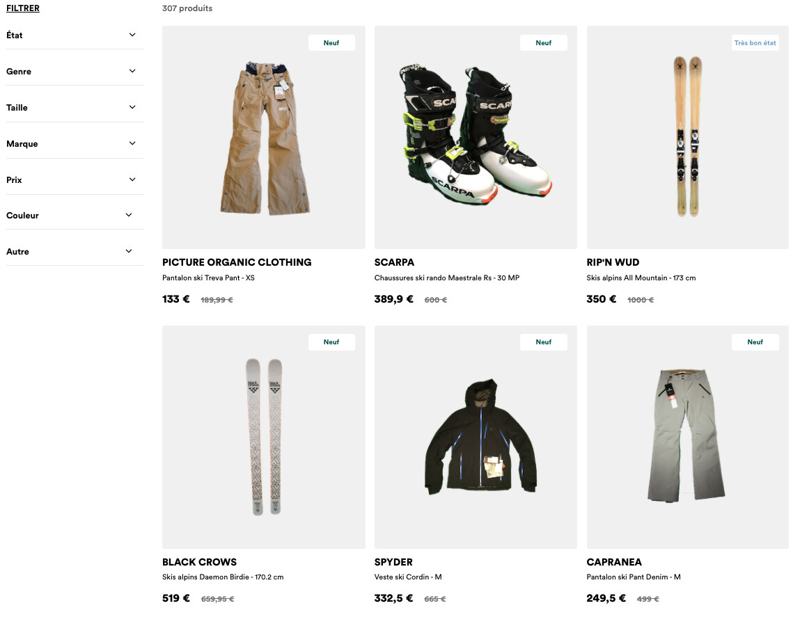
On the index page at the bottom is a basic version of the responsive repeating group I showed in the video.
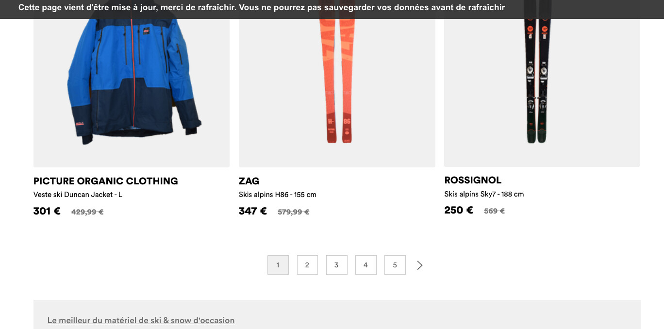
If you don’t want a fully responsive RG then the issue you have with the extra space, maybe related to how the elements are grouped to gether.
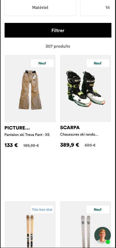
When I make RGs to display products, I create a reusable element that is the ‘card’ to display all details of the ‘listing’. After that I drop it into an RG and I usually don’t have any issues.


