This is a pain. Shrinking the page will always shrink a group proportionally. Is there a way to prevent this?
I design pages at 1200 width. Even if my containers are 800 wide, as soon as the page shrinks to 1000px for example, the containers start to shrink, making my page look awkward.
Is there a way to keep it from shrinking until the page’s width is less than the container?
Responsiveness can be a pain sometimes. It took me a while to learn it.
There are a few different ways to do this. Just one idea is to add empty groups on each side and have the minimum width set to 0. That way it will shrink slower and allow for a nicer transition. Let me know if that works for what you are trying to accomplish.
If that doesn’t help, maybe show a screenshot so we can see what you mean. It might give us a better idea of what you are trying to accomplish.
Unfortunately that doesn’t really fix it, just makes it slightly less bad.
This is maddening for me too! There must be some common-sense way to get around this?!
Example:
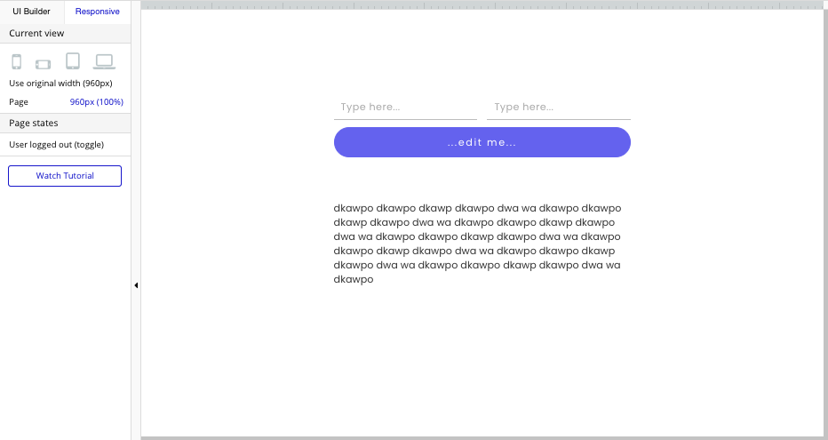
I have a page that’s 960px wide. A few elements (text box, buttons, input fields) in the middle. This is how it looks at responsive at 960px wide, the groups & text are now at the exact same width at which I created them in the UI builder:
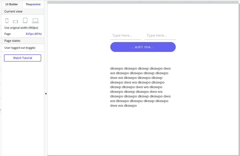
But as soon as the responsive view gets a pixel narrower than 960x (my page width in the editor), all the elements on the page start to narrow – even though there is still plenty of space on either side:
Adding the empty-group-trick on either side makes the narrowing only slightly less bad, but it still happens straight away when the view gets smaller than 960px.
Yeah. It’s tricky, the only work around I found is to make the page just slightly bigger than the inputs. Make sure to add a maximum and minimum width to it.
The reason it’s doing this in the first place is because it is trying to keep the left and right margins consistent to what you made. So it starts shrinking to keep the margins. If the margins are smaller, you will see a smoother transition.
Yes that makes sense! I thought that might be going on - so in my example, it basically treats the blank space (below, in red) on either side of the text as “content”, and when I make the page narrower (say by 20%), it will narrow everything equally:
So basically in my case above, to make the page just as wide as the text box, right? I figured that may be a “solution”, but that’s gonna create a lot of work across my entire app. Looks like I’m gonna have to get into breakpoints now and creating multiple versions of the same content that hides at different widths, yay
Spacer = empty groups with 0 min width? In this scenario, the empty space has no spacers. I said the 20% more to illustrate what I thought was happening (which seems to be right), not specifically the margins. So all good.
When I put in spacers, it does make the transition a bit smoother like you said, makes the text group narrow a bit less dramatic.


 . Yeah. That’s normally how it works. Test it first, to make sure it looks the way you want, before doing all that work.