This group is usually centered on the page and set to fixed width (506px). However, when the screen gets to <1000px wide, it is placed off the left side of the page. I can’t figure out what’s going on.
I had a similar problem with another group. So I deleted it and recreated it. It worked normally for about 10 mins. Then, it started showing the exact same behavior at <1,000px wide.
Any idea what might be going on?
Hey Scott  What are the responsive settings for that Group and Group I? Also where is Group - Virtual - 3 Groups on the page? Just wondering if that collapse in width is affecting the positioning of the group you are referring to?
1 Like
That group (the pricing calculator) is set to fixed width. It’s centered. No hiding rules, etc.
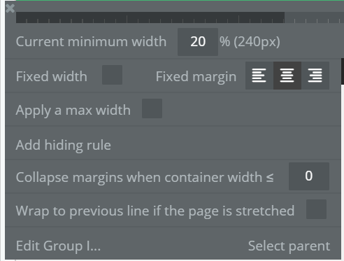
Group I has default responsive settings (see image below)
The “Group - Virtual - 3” is part of the white panel above (where it says “No logistical headaches”)
Not sure what you mean by this:
Group I settings:
Hmm, that looks correct to me as well! I had meant that if that hidden group was to the left of the centered group, that collapse in width would pull the centered group towards the left side of the page.
My only other guess would be if there are overlapping, hidden elements that may be interfering? If you want to copy the page without workflows and paste into a test app, I can definitely try to see what may be causing this!
1 Like

