I just don’t get the responsive rules at all. (Yes - I have read multiple forum questions and answers/videos and it’s just getting more and more confusing).
On our Dashboard there is a Bubble Lessons section with 2 columns. When you reduce the screen size the boxes in the right column all nicely move left and beneath the boxes on the left.
Given the same design, how on earth do I implement this responsive moving left and down behaviour?
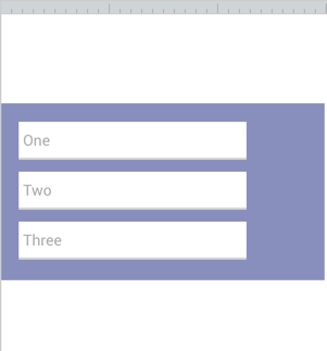
Hi @cowontherun, are you saying that you have a repeating group with two columns? If that’s the case – when the page width decreases, the repeating group cells will decrease down to the “current cell minimum cell width” before the right columns begin to go beneath the left columns. Let’s say for example that in your repeating group you have something like this:

The property editor shows in the parenthesis that the ‘current width’ (of each cell in this repeating group) is 267px. To the right of that, is the input where you enter/adjust what the minimum width of each cell is. Since I made it 267px, that means I don’t want the cells to shrink at all when the page width is decreased, and the right columns will begin to go beneath the left when the page decreases in size. However, if I change that 267 number to 100, the repeating group’s cells will shrink down to 100pixels, before any of them start to move from the right, to beneath the left.
Hi Faye,
No, I’m not using a repeating group but that information will be useful when I do, thank you! I just want to get the principles of how to move things left and down.
For example, I have 3 input fields in a row at the top of a full width container - all I want to do is ensure that the fields wrap gracefully beneath each other so it looks good on iphone etc. but I either can’t get them to wrap at all or one field wraps in a really strange position way too soon when there is heaps of space. I know I should be doing something with groups but I don’t know what.
I want to use the same wrap left and down principle when I have 2 50% columns and want to wrap the right column beneath the left column. In web development it’s a 2 second Float: Left job.
In Bubble I’m spending hours trying to work it out and I feel like there’s a basic responsive principle I’ve missed somewhere. It looks like groups are divs but I still can’t get this working.
Jess
Ohh! Right it can be tricky! I think it would be most helpful to view the public version of Bubble. It will show you all of the responsive settings they use and probably a better solution than what I could create in the forum app. This link is to check out the responsive settings in Bubble’s header, but if you go to pages, you can view all responsive settings for any page.
Header:
*Bubble Lessons:
@emmanuel I just realized I can’t get the app to show the responsive editor; I think the app may be stuck on ‘Saving…’
Here’s the Lessons Repeating Group from Bubble in the forum app for the time being (I just copy-pasted it.)  The app data from Bubble won’t be there in preview mode, but you’ll be able to view the settings in the UI Editor and Responsive Editor.
Editor:
Well it’s not actually saving, since it’s on local. We’ll check why it’s red. Did you refresh?
Ok, I didn’t realise the lessons were search results in a repeating group.
I don’t have a repeating group. For my input fields I’ve changed my parent container to be 0 instead of 99 and that’s now moving the fields left and I’m also reducing them in size but they are not moving appropriately. As per screenshots, how is the distance vertically between the fields controlled so they don’t collide like that?
Yes I refreshed a few times (I don’t think I’ve tried to edit anything/make changes to this app, I’ve only viewed it for responsive)
If those three dropdowns are in a group, then you would expand the top and bottom parts of the group container. So instead of this:

You’d have this result instead:
Editor:
So after you increase the top and bottom parts of the group container, it will increase that vertical space between your dropdowns so they don’t collide when they are all in one column. Then you make them all align to the left by clicking on this option for all three dropdowns:

1 Like
That’s awesome, thanks. The fixed margin advice was particularly helpful. It’s all working pretty well now. Now I’m onto my repeating group so your previous advice/links will be invaluable. Cheers.
Great! My pleasure! I actually hadn’t looked at that lessons element before you mentioned it, but now I see Bubble uses almost invisible separators between the cells seen here, to control spacing between cells. (Separator Settings: Opacity: 1, Width: 16). I never thought of doing it that way before and was previously just leaving space in the cell to create spacing between cells. Good to know that’s a better way to do it now! 

2 Likes


