
Bubble’s new workflow editor promised more clarity — but in practice, it adds friction, hides key actions, and wastes space. Here’s why that matters
 Product Deep Dive: Why Bubble’s New Workflow Tab Undermines Its Own Strengths
It’s been a few months since the new vertical workflow editor shipped to Bubble users, and I’ve really tried to give it a fair shot.
But after building in it daily, I can’t ignore what’s become obvious: while the intentions were good, the execution is flawed — both in UX and in product thinking.
 The Opportunity
Right now, as we all now, AI tools can already build basic landing pages, CRUD apps, and dashboards with minimal input.
Bubble’s edge isn’t in the simple websites — it’s in the 1% of apps that need real depth:
- Big, interconnected workflows
- Heavy use of APIs
- Lots of conditional logic
- Automated backend processes
That’s Bubble’s moat. But only if the product continues to empower serious builders — not slow them down with clunky UX.
 A Simple Task: Create a Backend Workflow
Let’s break down what it takes to create a custom backend workflow in the new editor.
 Step-by-step breakdown:
Step 1: Click the small “+” to add a new workflow
Step 2: Choose “Custom Event” from the first dropdown
Step 3: A second dropdown appears… with only one option

No, seriously. It’s a double dropdown that leads to a single choice — “Custom Event.”
I’m offering $100 to the first person who can name a tech product with over $10M in ARR that presents users with a nested dropdown for a daily task, only to offer one possible action.
Step 4: A modal opens just to name the workflow!
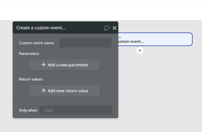
Step 5: Click again to add parameters — another Nested popup

Step 6: Click again to add return values — yet another nested popup
Step 7: Double-click the grid item to rename it (again?)
Step 8: Want to assign a color or folder? You can’t do it on the workflow itself — you have to find it in the left sidebar (No Right Clicks on the workflow block itself!)
And throughout this entire process, the main canvas — the area meant to help you work — sits completely blank and unused.
There’s no contextual panel. No inline editing. No visual clarity. Just dead space.

On a feature meant to replace the old workflow experience, this is a massive missed opportunity.
 More UX issues that slow us down
 1. Hidden workflow links
When a step triggers another workflow (like a custom event), there’s a shortcut button to “jump” to that workflow — but it’s only visible on hover.
Why? The canvas has plenty of space. There’s no reason this button shouldn’t be permanently visible. Hiding navigation adds unnecessary friction and makes debugging harder than it needs to be.
2. Incomplete trigger visibility
Bubble recently added a way to see which workflows trigger a Custom Event or API Workflow — and that’s a helpful start.
But it’s sorely incomplete:
- It doesn’t tell you where the trigger is located (what page? backend?)
- It doesn’t indicate whether the trigger is enabled or disabled
Because of that, users are forced to manually label every trigger just to make sense of what’s connected to what.
Want to delete a workflow? You now have to click into every single listed trigger one-by-one to see whether any of them are still active. There’s no fast way to spot orphaned or inactive flows.
3. Minor but persistent bugs
We are 5 months+ since the new workflow tab rollout and in addition to the UX decisions, there are still multiple bugs that have not. been addressed
- E.g., At any given time, I’ll see anywhere between 0 and 3 workflows highlighted in the sidebar.
These may seem like small details — but when they interrupt flow dozens of times a day, they compound into real product friction.
 What This Could Look Like
Instead of all this friction, imagine a workflow editor that:
- Shows the buttons you need right on the screen instead of making you hunt for them with a hover
- Lets you configure everything in one place without modal stacking
- Uses the full canvas space for visibility and structure
- Feels like a product that respects the builder’s time
So I built one — in under 30 minutes — using Elemium’s plugin. ( ![]() @thomas.mey)
@thomas.mey)

It’s not meant to be anywhere near perfect — but it shows what’s possible with a little bit of planning and thoughtful product design.
And that’s what makes this whole thing so frustrating: none of these changes are technically difficult.
They don’t require AI, or a new engine, or a rewrite. They just require product sense — and a basic respect for how people actually use the tool.
This isn’t a failure of code or execution. It’s a failure of product strategy / leadership.
Final Thought
The new workflow tab isn’t just inefficient — it reflects a product approach that feels at odds with what Bubble does best.
In a world where AI tools like Bolt and Cursor can generate working code, Bubble’s advantage isn’t syntax — it’s product and usability. The visual layer. The mental model. Allowing us to think in logic, not code.
But that advantage disappears if the product gets in your way.
This new editor needs a rethink — not just for aesthetics, but for function. For usability. For scale. For clarity.
Bubble doesn’t need to become more like AI.
It needs to become more like Bubble again.
EDIT: Replaced the GIF that Discourse flattened with a WebP file.