
Hi everyone,
I’m Laura Oppenheimer, a group product manager here at Bubble and I lead our efforts on monetization. This quarter, we’ve been improving our workload tooling, education, and documentation to help you build with confidence. Whether you’ve been on new pricing for months or preparing to migrate by October 1, we hope these updates will be useful tools for you and your app.
Now available:
We’re excited to share more resources that can help you better understand workload tools and how to optimize your app for efficiency:
- Out today: For our audio/visual learners out there, we collaborated with @Gregory John to create Bubble Workload Management, a 3-part video series on YouTube. In this course, you’ll learn how workload works, ways to track it, and best practices for optimizing for workload efficiency.
- ICYMI: We partnered with @Petter Amlie to refresh the Workload section in the Bubble Manual with new and updated articles, including how to use app metrics and an optimization framework, checklist, and case studies with actionable tips. Thanks for the continued feedback on them!
Relatedly, it’s awesome to see community members like @Jici sharing how they optimized their apps for efficiency. They helped a user portal app go from consuming 850,000 WU to 150,000 WU a month - as well as reducing a 24 hour process to only 2 hours. Every app is unique, but excited to hear more examples of what’s worked for you.
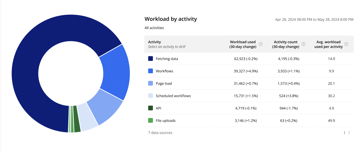
Sneak peeks: App metrics updates
We’re making two updates to the app metrics page: Improvements to the pie chart, and new data on workload consumed over time. Special thanks to @anon838245 and @boston85719 for the feedback and eyes on these two projects!
Pie chart improvements
Currently, you can see the total number of WU consumed by each activity type, and its percent of overall WU consumption. Next month, you will also see how many times a given activity has occurred and if it’s worth digging into further. These are the activity types that you’ll have visibility into: workflow runs, pageloads, searches, API calls, file uploads, autobinds and imports/exports. This will make it easier for you to optimize your app’s workload consumption.
For example, today if you hover over a wedge on the pie chart, you can see that there were 1,000 workload units consumed. But you can’t see if it was a single workflow consuming 1,000 workload units or 1,000 workflows consuming 1,000 workload units. One of these you may want to look into (it’s the single workflow consuming 1,000 WU!), while the other may not be worth your time. The new update will offer this visibility.
Look for this rolling out in the first week of September — along with more UI improvements to the pie chart and app metrics page. (Those with eagle eyes may have already spotted an update to the colors in the pie chart.)

Data on workload consumption over time
Currently, the app metrics page shows two charts: a pie chart showing what is consuming workload and a bar chart showing workload usage over the past 30 days. Next month, we’re shipping a new chart that will let you view what activities are consuming workload and how your consumption is changing over time.
(Some inspiration for where we’re headed here ![]() )
)
When you’re looking to optimize your application, knowing what to focus on is the first step. This data will help identify the biggest things that have changed that might need your attention, so you can optimize your application — and your time.
As always, we look forward to hearing your feedback.
Laura


