I had trouble with this login / sign up template as well, so I ended up just creating new login and sign up pages (separate from one another) and rebuilt the workflows. Didn’t take long at all and haven’t run into this problem since!
You have to change both the height of the “popup” element(s) within the reusable element as well as the height of the Sign In / Login Popup on each page where you’re using it.
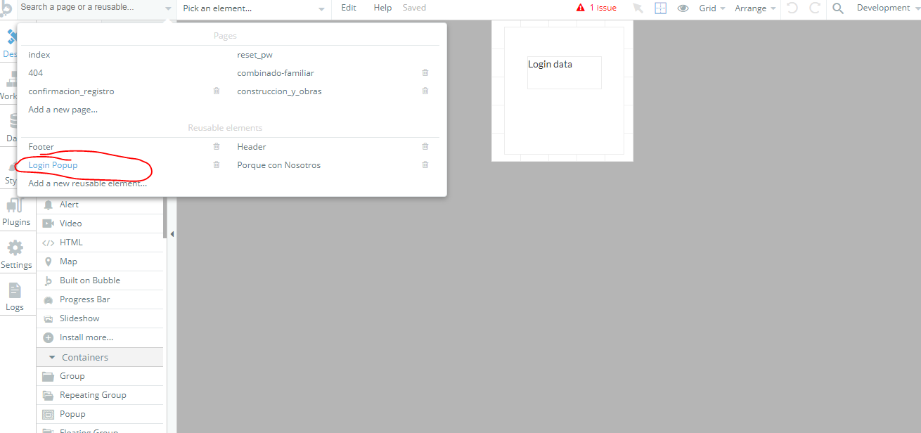
@jordan.shotwell but how did you manage the workflow flor sign up login? I tried the way you are sayin but I faced another problem. Once deleted, the sign up login, I can’t find the new ones created by myself as I describe in this post
basically, it doesnt recognizes the new reusable element
Any screenshots of that problem? Sounds like you deleted the element from the page but it’s still saved as a reusable element in the app. I would ensure in the Pages dropdown at the top that the old reusable element is deleted. Otherwise, you may be selecting the old sign up button instead of the new one.
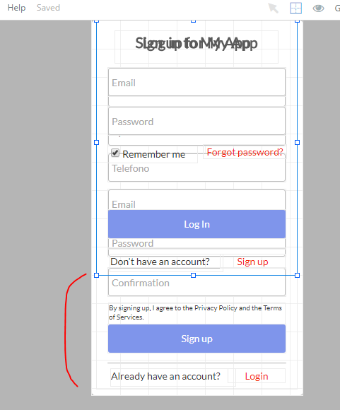
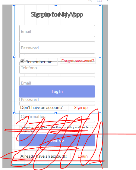
Make the login group as long as the sign up group.
On login group, below “don’t have an account?” add a group.
Set that group to collapse height (it’s a check-box within the edit / settings for the group)
Set the group to be not visible.
Then, when you view the reusable group you should see that the height of that login group is now shorter because that group’s height is collapsed which eliminates the extra space.
Well, there’s going to be one for the next person after you because we’re going to get this.
Here’s how to do it. Same steps as before but 1 important caveat that I forgot (my apologies) - put the collapsible group outside of the other groups (for some reason collapsible groups within other groups doesn’t seem to work).
As such, the group that’s collapsible should be below the group with the content like this:
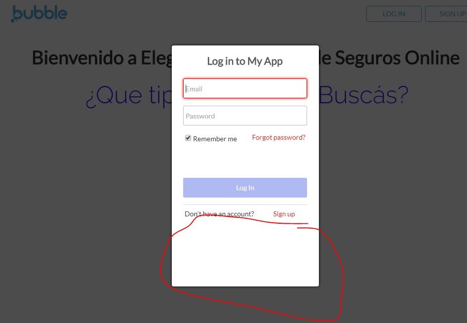
If you look at my example image, you’ll notice that I have the collapsible group set to be visible when the other view (e.g., when the view is “sign-up”). Did you try something similar?
It shouldn’t affect responsiveness because it’s all vertical changes (not horizontal). One way to check is to go to the responsive tab in Bubble and see what it looks like in different widths.
I find it helpful to do a quick check on all of the elements / groups to see which ones are fixed width and which ones aren’t – I often find I want to toggle one or two to a different state and then check the responsiveness.


