
Great!
Yep good call on colour mapping - added to roadmap. It’s available with the amCharts elements… I will port it over for the next update.
1 Like
@exception-rambler Hey i am having a problem where when ever i add any kind of nested labels the charts totally vanish and do not work
Hi Ryan. If you drop me a PM with a link to your app (and open up access in Settings > General) I’ll take a look.
Thanks, Ed
I’m having trouble using this plugin. I was able to use the amCharts plugin just fine, but when I upgraded to the $5/month subscription plan (so I could go beyond a 2 series chart) it pointed me to the chart tools plugins and now the same expressions I was using for amChart do not work with Chart Tools.
Admittedly, I am a novice bubble user but I was really hoping the fundamentals wouldn’t change in the premium version. My chart doesn’t load, rather I just get a “spinning icon”.
I have read the documentation but can’t figure out what I’m doing wrong.
Hey @Kamp - when you upgrade to Chart Tools you get access to a premium version of amCharts which allows you to build out multi-series charts, AND (slightly confusingly) you get access to two additional ‘Chart Tools’ elements. So you will have four elements to chose from, plus the original two free amCharts elements - although you’ll stop using them now and should remove them.
Your original expressions will work in the premium amCharts elements but they will need tweaking for the ‘Chart Tools’ elements. This is because grouping / aggregation functions work a little differently across both pairs of elements.
I’m going to get back to you via your DM so we can get you on the right tracks.
I have just pushed some upgrades and features to Chart Tools. Take a look below, there is a link included to an Editor window example and documentation after each.
In Version 3.5.0
New with Chart Tools elements:
-
Stacked charts added : Series can now be ‘stacked’ vertically… Just pick Stacked chart within Data Properties. Demo chart | Reference
-
Control date formats : Dates can be presented in five ways: Jan, Jan 1, Jan 2018, 2018, 1 Jan 2018. So, summary charts (by month or year) can now have matching labels. Demo chart | Reference
-
Improved unit controls : Units of measurement can now be positioned left or right of axis values. Demo chart | Reference
-
Use points or commas : Numbers that have decimal points can now be separated out using either a Point (.) or a Comma (,) - . Reference
-
Padding added : You may sometimes need to pad small charts if you need to be fully Internet Explorer compliant - you can now do this. By default these will be zero but small corrections (in px) will fix any issues you are seeing in IE 11.
Please email suspected bugs to ed@chartbox.co or PM me on the forum.
2 Likes
I have an interesting use case for Chart Tools (current subscriber) I was hoping the community could help solve. I want to trend metrics against a benchmark. So I want the chart to be able to show 12 months of trended metric data in one series (that will have changed over time) up against a second 12 month series of a flat line metric benchmark. I’ve been solving this by creating duplicate benchmark data entries for every month in the chart, but wonder if there is a better way to do this?
Some very small changes to update you on… Details below.
Some further updates in the pipeline based on features requested by users. And a very big update coming in early 2019 

In Version 3.5.3
Chart Tools and amCharts elements:
-
Documentation now in property editor : I have now brought over the plugin documentation from here to the Property Editor.
-
Bug fix : Have also applied a fix to a behaviour with multi-series charts that had crept with some background code changes.
If you need further support, or think you have spotted a bug just get in touch with me at ed@chartbox.co or PM me on the forum.
2 Likes
HI @exception-rambler Happy new year! I have a future request to help format the x axis labels on charts. At the moment there are occasions where x axis labels are not shown on some charts and it appears to be that it doesn’t know what to do with the labels at certain number/sizes - keep horizontal or swap to inclined / x degrees.
It would be good if this was either fixed or we had more control of the axis labels.
See below the last chart option.

Hi @StevenM and HNY!
I have a raft of changes upcoming, I could add in a control that would allow you to set the max. angle of rotation, including preventing it from rotating at all. Would that achieve what you are looking for?
Yes that would be perfect!
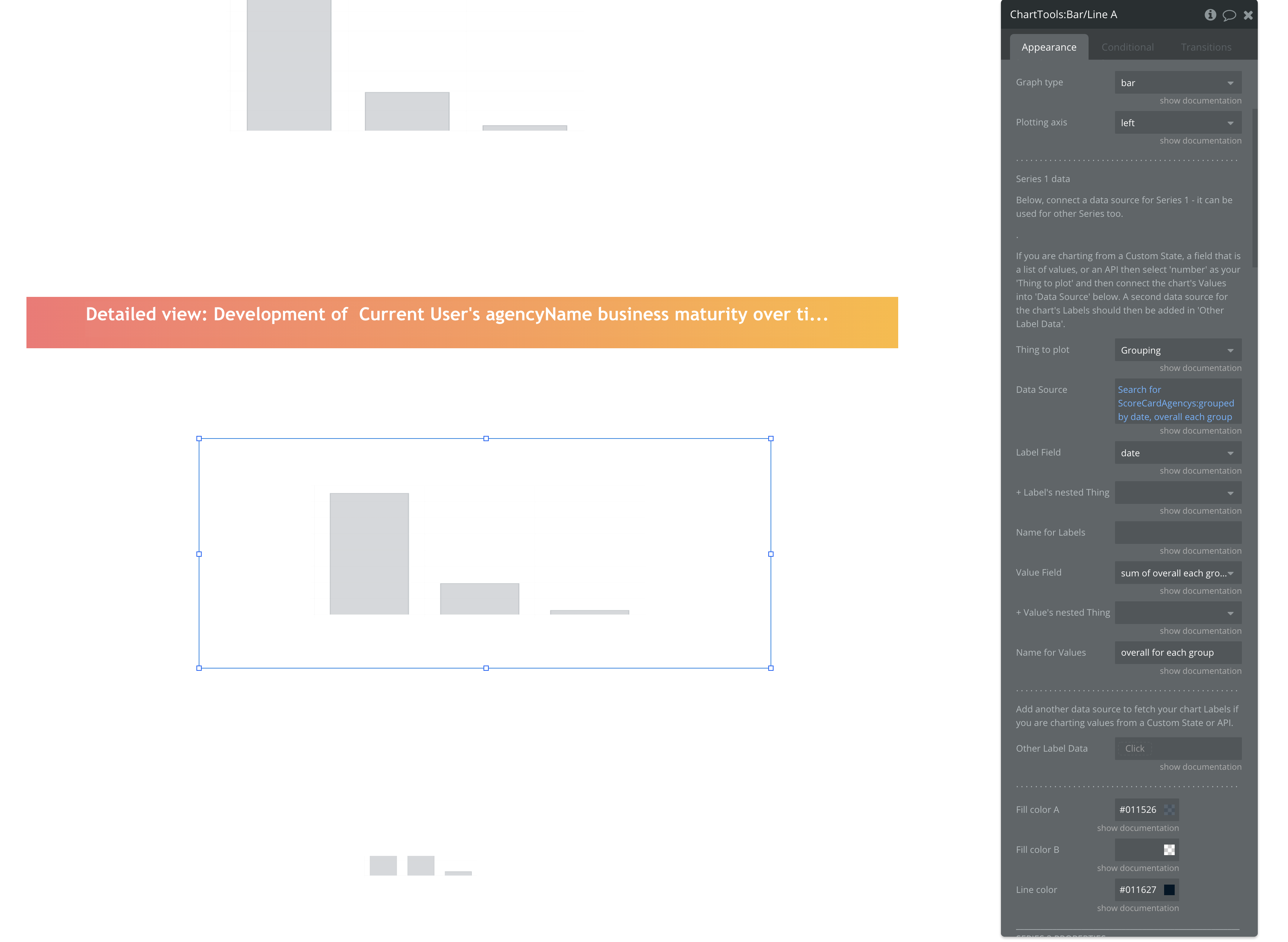
Hi @exception-rambler Hello everyone, I am using the paid plugin of chart tools to create a new chart that contains multiple series. so I find some problem in manipulation and extract data from the database to draw an important chart in my project.
so if anyone who works in this plugin can give us some helps to find a solution to build this chart with chart tools.
pictures down below contain all needed information. thanks


1 Like
It looks as though you posted this twice? I have replied to you here.
Hi @exception-rambler I’m using some of your charttools graphs in my app and they are great.
I was wondering if you were planning to add the ability to execute actions when clicking on chart elements and allow the passing of data to the workflow?
For example, I have a pie chart showing the count of a thing based on a few different properties (i.e. 7 blue, 3 red, etc). When the user clicks on the portion of the chart for that property, I want to redirect them to a page with a list (repeating group), filtered by that property (e.g. have a repeating group of the thing filtered for red).
I can think of lots of other use cases for this which would be really cool!
4 Likes
Hi @exception-rambler, could you add the ability to go to another page from the chart and send data?
For instance, if I’m showing task data based on priority, then I want to be able to click on one of the priorities (e.g. High priority) and have it go to the Task page and display only the records with the priority that was clicked in a repeating group.
1 Like
Hey @jarrod - I’m currently working on the next release and I just incorporated your suggestion today. It will be available soon.
Ed
Hey @Kfawcett - I’m thinking this is similar to the request above. What I have put in is 1) an event that fires when an element in the Chart is clicked and 2) a (few) custom states that carry the value of the element that was last clicked.
So you could easily combine (1) with (2) to achieve what you are describing.
A few more changes and a bit of testing and I’ll have this out.
2 Likes
@exception-rambler thanks heaps! looking forward to it.
Am I just missing something or is there not a way to format the labels on the Y axis.
For example, my values on the Y axis range from $1M to $10M. Currently I can only see a way to add a prefix to the original value of 10000000.
I would like to format to $10M for readability and space.
Additionally, I would like to edit the step for the Y axis?
hey @derek1 - currently you can only handle the ‘$’ and ‘M’ components. Reducing 1000000 to 1 would need to be pre-processed through a workflow currently. I will look at incorporating this in though.
Step size is coming within the next update.