First read the docs
If you’ve got all keys setup it tales 45 mins to upload a build to the stores.
- For android you have to upload the aab file on google console
- For IOS bubble upload s the build itself and you’ll have to send the build for review on apple connect
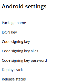
Code signing keys are a pain to setup
Just follow the documentation, and remember on android donot change the key store name only edit the alias name if needed
Be realistic!
2 Likes
Docs are getting updated as we speak with the instructions for BubbleGo on Android
1 Like
Its in open testing, similar to apple’s beta testing on testflight, which is why its not searchable on the Play store
1 Like
No, not yet unfortunately. But something that is on the roadmap to fix
1 Like
This is what FaceID does, but we have not implemented it yet.
2 Likes
I guess there’s also the standard Bubble Temporary User functionality. How long does a Temporary User last on Mobile? Ideally, it would last forever, as long as it’s the same device and the app hasn’t been uninstalled/reinstalled.
2 Likes
This is a good question - interested
1 Like
This is what caused me to abandon Mobile Beta for the project I was excited about building for. ![]()
1 Like
That’s too bad… I’m guessing reset password has the same failing?
So I’m still stuck. Let’s review the series of events that got me here.
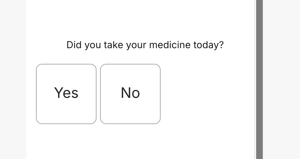
I need to build a survey for a research group which will include choosing from a list of options (what would traditionally be handled with radio inputs).
- There is no radio element.
- There is no Repeating Group to roll your own
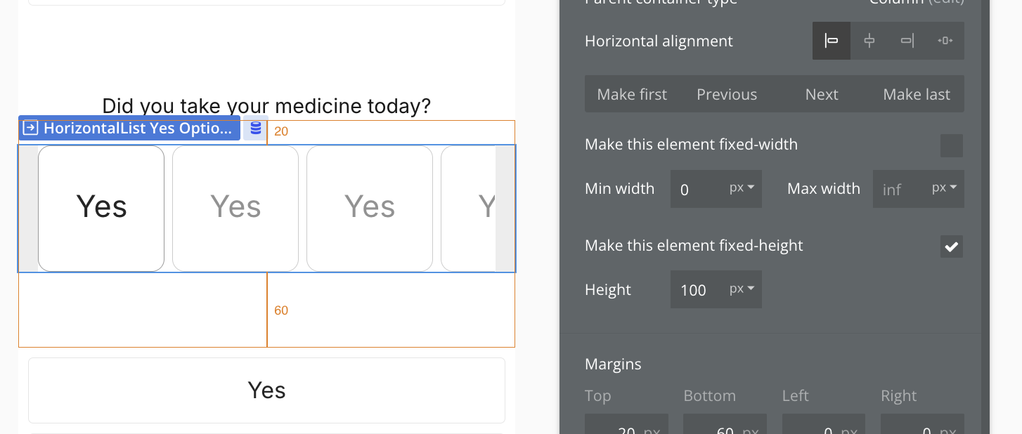
- Horizontal List has an unchangeable minimum height, and can’t wrap, and has other constraints that make it not work well.
- I can’t preview WebView to see if a form built on a Web page works.
- Horizontal List has an unchangeable minimum height, and can’t wrap, and has other constraints that make it not work well.
- There is no Repeating Group to roll your own
Brainstorming my next steps. Here’s my ideas:
- Apply a ton of design effort to make the horizontal list work for selecting options.
- Go through the process of publishing the app so that I can install it and see if it works.
- Re-think my survey so that each question-type uses its own page, giving me access to vertical list.
- Wait for short list.
I prompted an LLM to give me suggestions for alternatives to Radio select, and not a single one of them is possible to build in Mobile Beta today, as far as I can tell:
List with Checkmarks (a.k.a. “List Selection”)
- How it works: Present the options as a list, and tapping an item highlights it with a checkmark (✓) or a filled background.
- Example: iOS Settings menus (e.g., selecting a Wi-Fi network).
- Why it’s better: Large tap targets make selection easy, and the checkmark provides clear visual feedback.
2. Segmented Control
- How it works: Display options as adjacent buttons in a horizontal row. The selected option is visually highlighted.
- Example: iOS
UISegmentedControl(often used for filters like “List / Grid” view in an app). - Why it’s better: Great for a small number of options (2–4), avoids excessive scrolling, and provides immediate feedback.
3. Button Group (a.k.a. “Pill Select”)
- How it works: Similar to a segmented control but often in a scrollable row with pill-shaped buttons. The selected button is highlighted.
- Example: Tag selection in Twitter or filter options in many e-commerce apps.
- Why it’s better: More flexible than segmented control; works well when there are more options.
4. Cards or Tiles
- How it works: Each option is presented as a tappable card or tile with an icon, label, or even an image.
- Example: Google Pay’s payment method selection or ride type selection in Uber/Lyft.
- Why it’s better: Large touch area, visually engaging, and allows for more descriptive content.
5. Dropdown with Inline Display (a.k.a. “Expandable Picker”)
- How it works: The user taps a field to reveal a full-screen or modal list of options. The selected option replaces the placeholder.
- Example: Mobile OS settings for selecting a ringtone or language.
- Why it’s better: Saves screen space while still supporting many options.
6. Wheel Picker (a.k.a. “Picker View”)
- How it works: The user scrolls through a vertically spinning list (like a slot machine) to pick an option.
- Example: Date pickers in iOS.
- Why it’s better: Familiar for selection tasks where precise scrolling is preferable.
I woukd use a vertical view for this.
1 Like
Or a series of sheets
1 Like
Has anyone managed to generate it using the documentation’s guidance?
I was unable to generate the code signing key.
Very interesting journey @brenton.strine, right now my main problem to be able to dev properly is that there’s no way to debug in preview mode. So a lot of stuff seems to be bugy. For example I’m sending geographic data through properties via the “go to view” action , from one sheet to another to be able to filter repeating group, sorry “vertical list” and nothing happens… Impossible then for to debug it. Does is come frome the wf that doesn’t set the property right once going to the view (I would need a step by step function here), does it come from my vertical list no being able to read the geographic data properly (I would need the feature inspect here) whereas it works with other filters such a numbers type, etc…
No popups… that makes sense… but where will I store my variables? Ah, Floating Group does the trick just as well.
Argh!! No autobinding!?!?! Do you know that this will cause me to have to do approximately THREE SECONDS more work!?!
More workflows, but less need to give groups a data source unnecessarily. Fair tradeoff. The larger contingent of Bubblers are anti-autobinding anyway.
The inability to have Horizontal Lists fit width to content is a problem. If I only have a few items, they look real bad left-aligned.
yucky
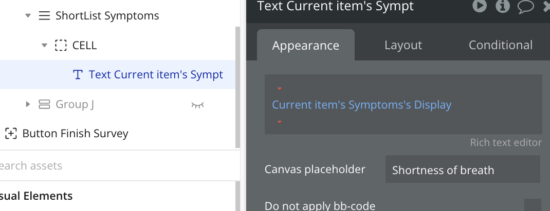
Ok, this is cool. The RG replacements (“List Elements” I guess we call them?) come with a built-in cell. One of my conventions for RGs is ALWAYS HAVE A CELL AT THE TOP, and Mobile actually enforces this! Good move.
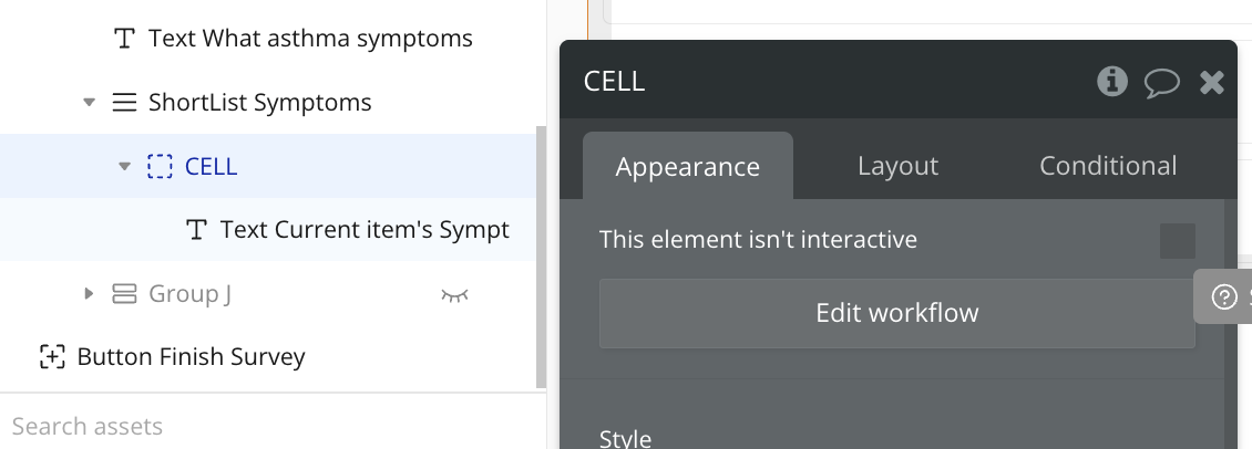
Furthermore, you always have access to Current Item’s Thing, which means you don’t always have to reference back to the CELL all the time. In fact, you can’t, because the CELL doesn’t even allow a data source! This is really great! Thanks, Bubble engineers!