
Any idea of how this graphic was created?
I know the data comes from here and I’ve already installed the API but I cannot figure out how to show the information as seen in this picture.
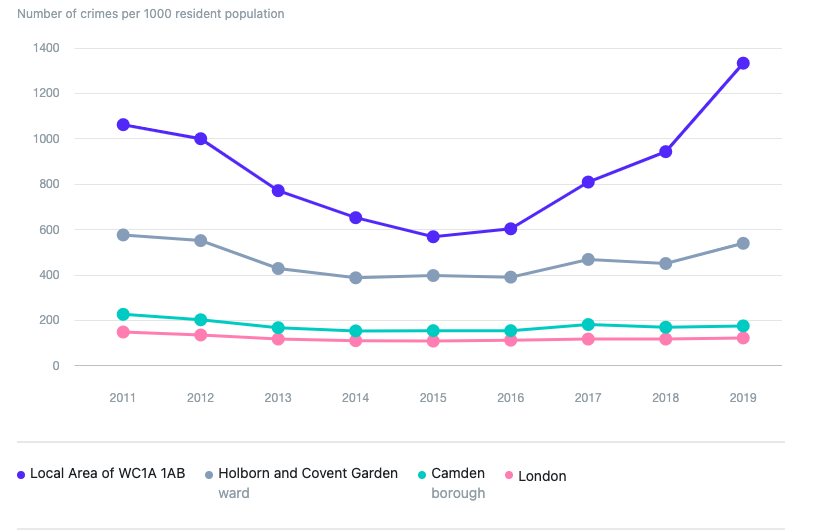
Please, can anyone help me?
Thank you!
Any idea of how this graphic was created?
I know the data comes from here and I’ve already installed the API but I cannot figure out how to show the information as seen in this picture.
Please, can anyone help me?
Thank you!
You may have to create a plugin to more easily parse the data
Can you show the data stream you receive back from the api?
I’m fairly confident you could display this on my chart plugin!