Group tree nesting behavior

So, I’m working with the default header in a brand new app.

I copied & pasted the default button group with “LOG IN” and “SIGN UP” into a new group, then changed the new buttons to “LOG OUT” and “PROFILE”.

I added workflows to show/hide the two groups when the user is logged in/out, respectively.

It works correctly as long as the groups aren’t aligned directly on top of each other.

If I stack the groups in the same physical location the show/hide logic stops working because, and this is just what I think is happening after some debugging, it looks like the new group is automatically jumping inside of the old group.

If I slide the new group over a bit so the two groups are no longer directly on top of each other, the new group magically jumps out of the old group, so that both groups are at the same level.

I can see this happening in the Elements Tree.

Is that supposed to be happening? Is there a way to turn off any kind of “helpful automatic grouping” so that I can manually control how the groups nest? It’s not at all intuitive that physically aligning two objects would force them to group together. I tried changing the “select parent” option but it didn’t have any effect.

Alternatively, is there a more Bubble-way of showing/hiding relevant elements based on conditions such as the user’s logged in status?

Hello, Welcome to the Bubble forum! :slight_smile: Can you share a link to your app in the editor mode so that I can take a look at the elements and their groupings?

Like this?

That’s the URL to preview the app (also helpful!); the editor URL would be:

In your app, there are three groups. Group B (the wide group containing the site logo), Group Buttons Logged Out (Login/Signup) and Group Buttons Logged/In (Logout/Profile). When I opened the app, Group Buttons Logged Out was within Group B, but the Group Buttons Logged In were not within Group B.

To ensure that the correct buttons are shown to a User (based on whether they are logged in or out), you can use conditional formatting. On the Group Buttons Logged In, you have this statement:

However, this is telling Bubble that the Logged In buttons should be shown when the User is logged out, so that just needs to be switched to:

*I also unchecked ‘this element is visible on page load’ in the property editor for this group since we only need it to be visible when the Current User is logged in.

Then I placed the Logged In Buttons directly over the top of (not within) the Logged Out Buttons Group. Both of those groups are all contained with Group B. I think what happened before is that the Logged In Buttons group was accidentally placed inside the Logged Out Buttons Group. To undo this, you would drag the group out, and then use arrow keys to manually move it back to the right.

In the editor mode, you can view/hide different groups using the eyeball icons.

Once Group B is expanded then you can select/deselect the groups as you need to edit them. Is this element structure what you were looking to have?

2 Likes

Thanks @fayewatson

Yes, it’s working the way I expected it to work now. It looks like the thing I didn’t understand is that apparently moving an element with the mouse will drop it inside of a group. I wasn’t expecting that and didn’t think to try nudging it with the arrow keys as an alternative.

For what it’s worth, that’s counterintuitive behavior to me. Nothing else I’ve ever worked with just silently forced things into groups when they were dragged on top using the mouse.

So now the button groups have conditions affecting visibility AND the header has workflows that show/hide the button groups based on the same conditions. I assume only one of those is necessary; which one is a better practice? I noticed that the workflows got erased at some point back when I was trying to solve the problem through trial & error, so does that mean the conditionals are a better option?

No problem :slight_smile: Bubble will only drop a group inside of a parent group if the entire group fits into the parent group. In that header, space is really little tight and those groups are almost the exact same size, so I don’t think the parent group red border is really visible in that scenario (the red border becomes visible to alert you that a group is being placed within a parent group). For almost everything else (aside from tight groups like that) - you will always know something is going to be placed within a parent group because the borders of the parent group will turn red. Tricky with the header, but for basically everything else it makes things easier, especially when you need to drag a lot of content into a group for responsive purposes, for example.

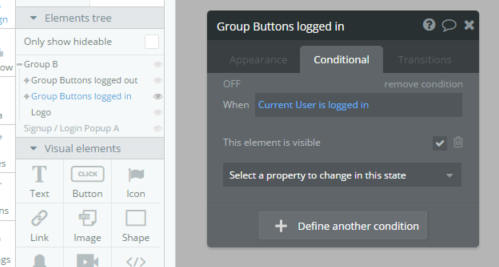
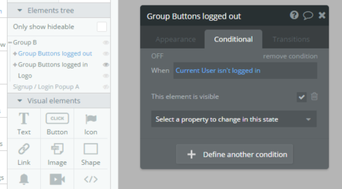
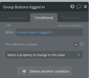
Showing and hiding works (it doesn’t cost you any workflows since nothing is being changed in the database), but I do think it’s better to use conditional statements for elements that are visible based on whether a User is logged in or out. Custom states are also especially useful to implement in order to show/hide different content based on the value of a custom state. They’re a little tricky for me to explain, but custom states can be set on the page, or on any element itself, and they also don’t cost any workflows because you’re not making changes to the database there as well.

An example of custom states and visibility conditions would be if you had a homepage, with tabs that were supposed to show different content based on the tab a User clicks on. Instead of setting up show/hide workflows for each tab (Ex: Home, Newsfeed, Store), you can create a custom state on the page itself. In the workflow this would be:

“When Home is clicked”
Element Actions → Set State → Element: index (the page itself, or any element of your choice), Custom State: create a new custom state… “Current View” Type: Text, List: No.

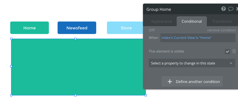
And the value is the label what we will then use in conditional formatting. So when ‘home’ is clicked, we set the Current View custom state to “Home” (by manually typing it in the value input):

Then the next step is to tell Bubble what to do (or show) when the state is Home. I just created a quick example on the index page of your app. In the conditional formatting of the ‘Home Group’ there is this conditional statement:

This same process is used for the other buttons and groups, which are shown/hidden based on the most recently clicked button (which set the current value of the Current View custom state). This process is useful especially if you are planning on building a mobile app because all content must be on one page for native mobile apps, shown and hidden using groups and custom states like this.

4 Likes

@fayewatson Thank you, I really appreciate the explanation and example! I’m gonna digest this.

2 Likes

My pleasure :blush: Please feel free to let me know if anything was confusing or if you have any other questions at all. I found custom states especially tricky to understand for quite a while, but it definitely becomes easier after doing it a few times of course!

2 Likes

What’s wrong with these buttons? The group that’s supposed to be invisible is still visible.

Here are the settings

It’s because the checkbox ‘this element is visible on page load’ was checked for Group Buttons Logged Out. If that’s checked, the element will always be shown unless you had a conditional statement which hides it. For example, the statement could be:

Group Buttons Logged Out:
“When Current User is logged in” This element is visible (unchecked) - that would hide the element to a User who is logged out.

The group was ‘shown on page load’, ‘show when Current User isn’t logged in’, but never hidden. There are a few ways to do this, but I just unchecked visible on page load and kept the conditional statement because I think it’s a little easier organization-wise to not set things visible on page load, and then use conditionals on when to show them (it can be whatever you preference is though of course)

1 Like

Ah, thank you for that!

Is there a way to add details to the documentation? The “see reference” linked to that option takes me to an entry that could do with a rewrite, which I’d be happy to do, or at least add a note that “by default” means “will be made visible when the page (re)loads” which is clearer than what’s there now.

Also, it would be nice for all of the controls that affect one particular concept to be cross-referenced, which again I’m happy to do as I run across them. There are at least two check boxes that specifically affect visibility, but they’re on different menus and their documentation doesn’t mention how they relate.

The best way to make changes to the docs at this stage is to email us at support@bubble.is with what you’d like to change, and we’ll push that right away.

2 Likes

Okay, I started doing that.

A stronger reason to do this, is to prevent inappropriate content being shown before the page knows if the user is logged in or not.

1 Like