Help formatting Cornell style notes from API call

Hi guys,

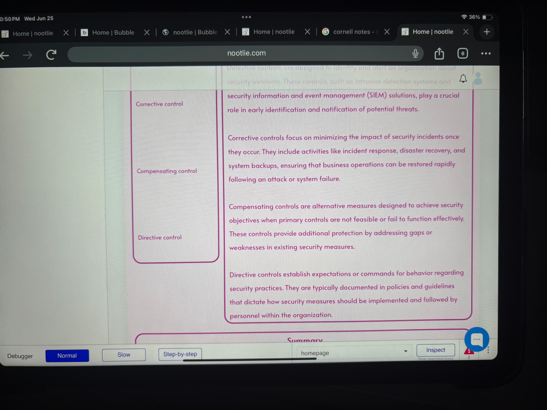
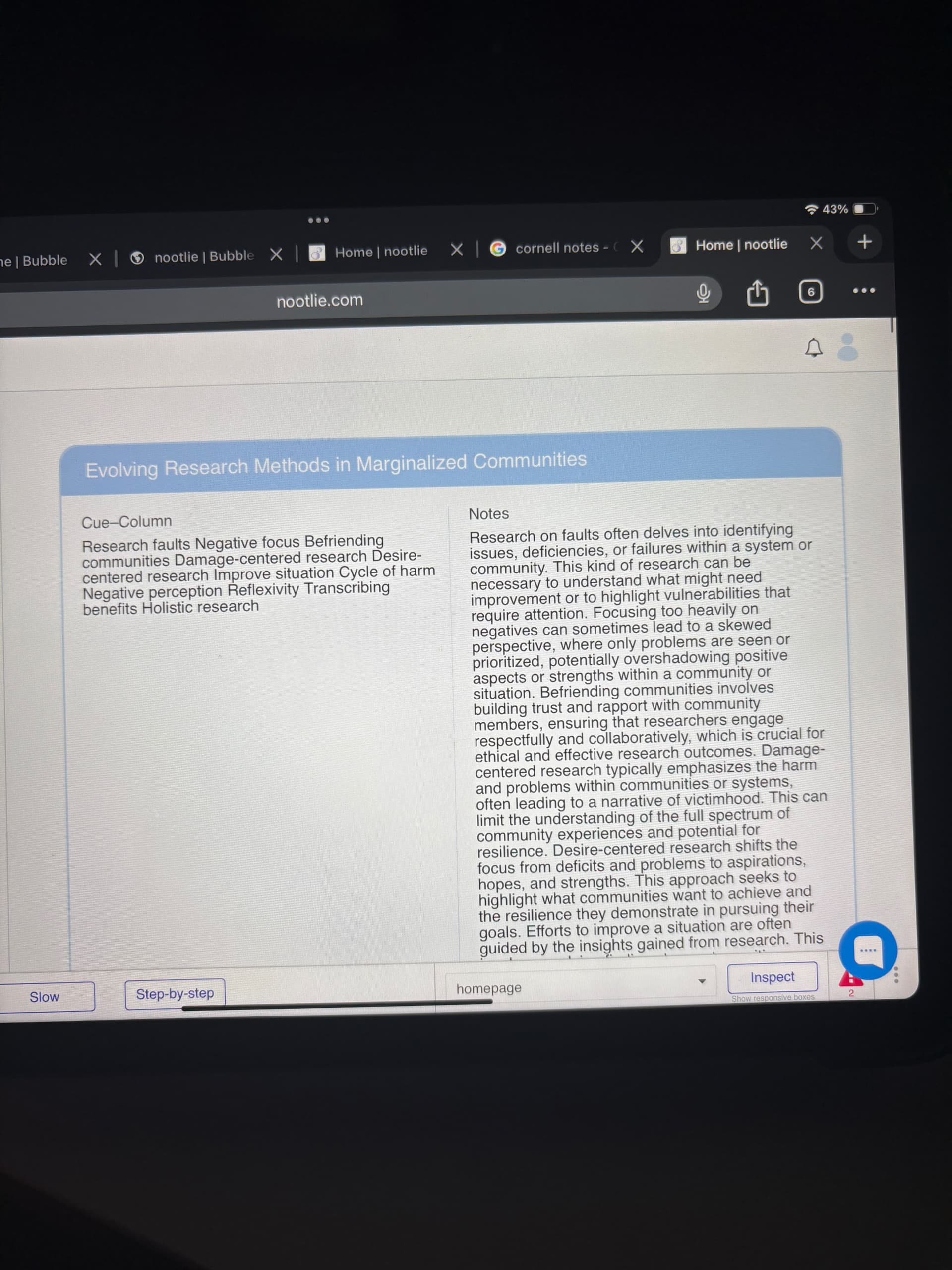
I made a tool where you can upload almost any kind of material and that is converted to notes. One of my options is Cornell notes. I am having trouble making the cue column align with the notes column. This is closest I can get it to with spacing :

I’ve tried an html/css code and this is the closest I’ve gotten to it:

Maybe my API setup is wrong but this is the best I could set it up.


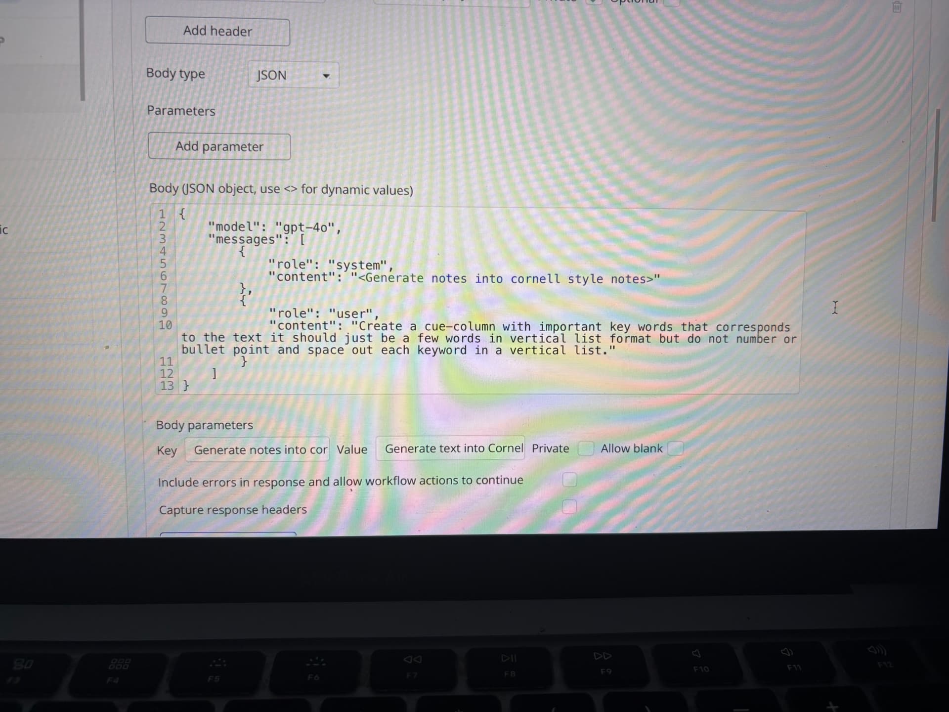
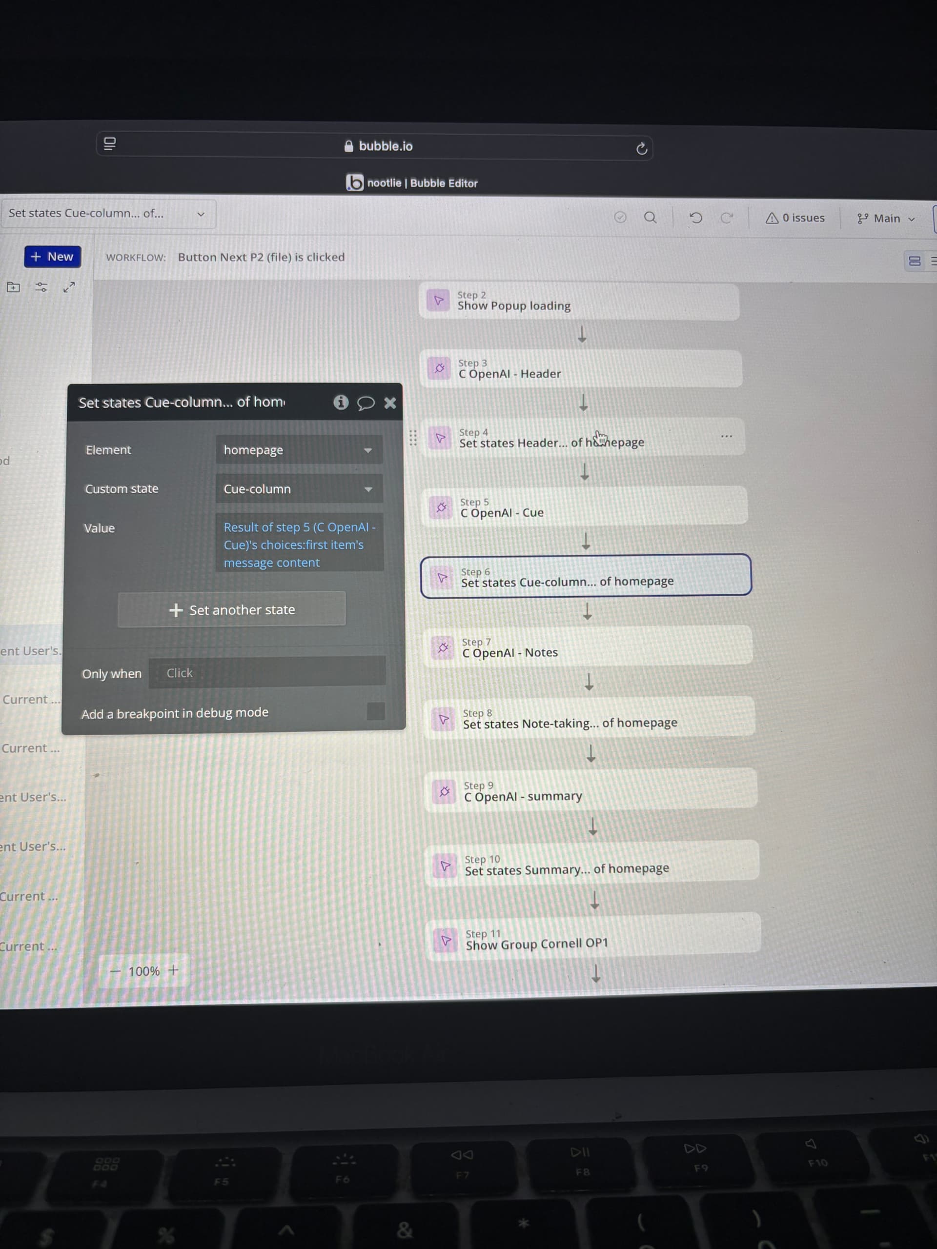
So the header, cue column, notes and summary are all in a different call but in my workflows I generate the notes column from what is generated in the cue column (I hope that makes sense).

Is there anyone who knows what I can do to fix the alignment issues? I’ve been getting consistent interest in my platform and I’m concerned that the misalignment issues with my Cornell notes feature may deter them from staying. I’d really appreciate any help :slight_smile:

Goto colum layout and it the bottom there would be a checkbox
image

Uncheck it and it will take the avaialbel space, also make sure just above it its not fix height .

API secction have nothing to do with layout. if you have issue ping me, i am availbel for 1 or 2 hourse , i can help you with it, without any fee.

Or if you have any other quesiton.

1 Like

Hi! Thank you for your advice. The formatting did look a little better but still looked a bit misaligned toward the end of the list and when switching the device size. I actually just figured it out today! I use 1 repeating group with 2 groups inside for the cue text and notes text. That worked with keeping the cue column and notes column aligned. Again thank you for your help :slight_smile:

Sorry, I actually created 2 separate RGs, one for the cue and the other for the notes