Hello everyone,
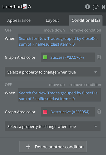
I’m currently working on a trading app where users can log their daily trades. I’m looking for guidance on how to create a specific type of line chart to visualize these trades. The chart should display each trade individually and, based on whether the cumulative gain/loss of that particular day, if less than 0 or greater than 0, it should be color-coded as red or green, respectively.
Could someone please provide guidance or point me in the right direction on how to implement this functionality using Bubble.io?
Thank you in advance for your help!


