


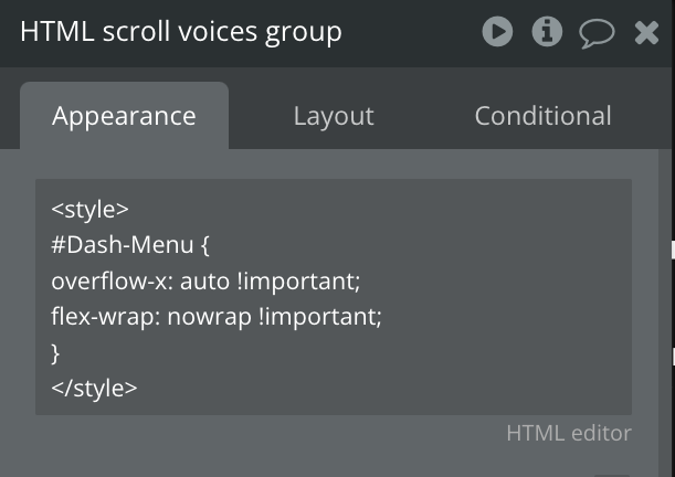
Give the group an ID attribute like: Dash-Menu
That goes in the group Appearance section at the bottom if exposed.
try this in a html on the page.
Style before
#Dash-Menu { overflow-x: auto !important; flex-wrap: nowrap !important; }/Style after
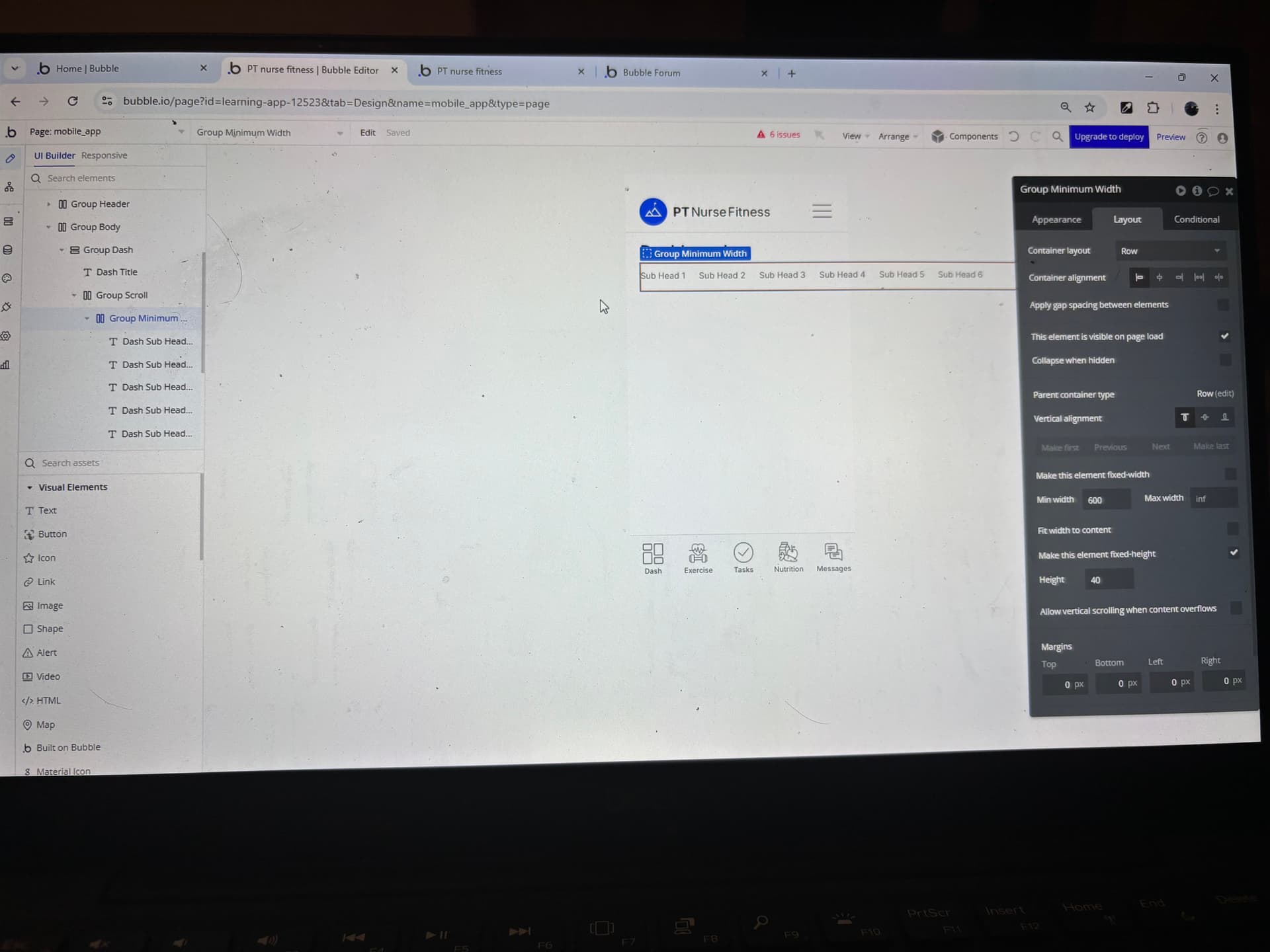
And change your min width to 300 on your group.
Thanks for the reply.
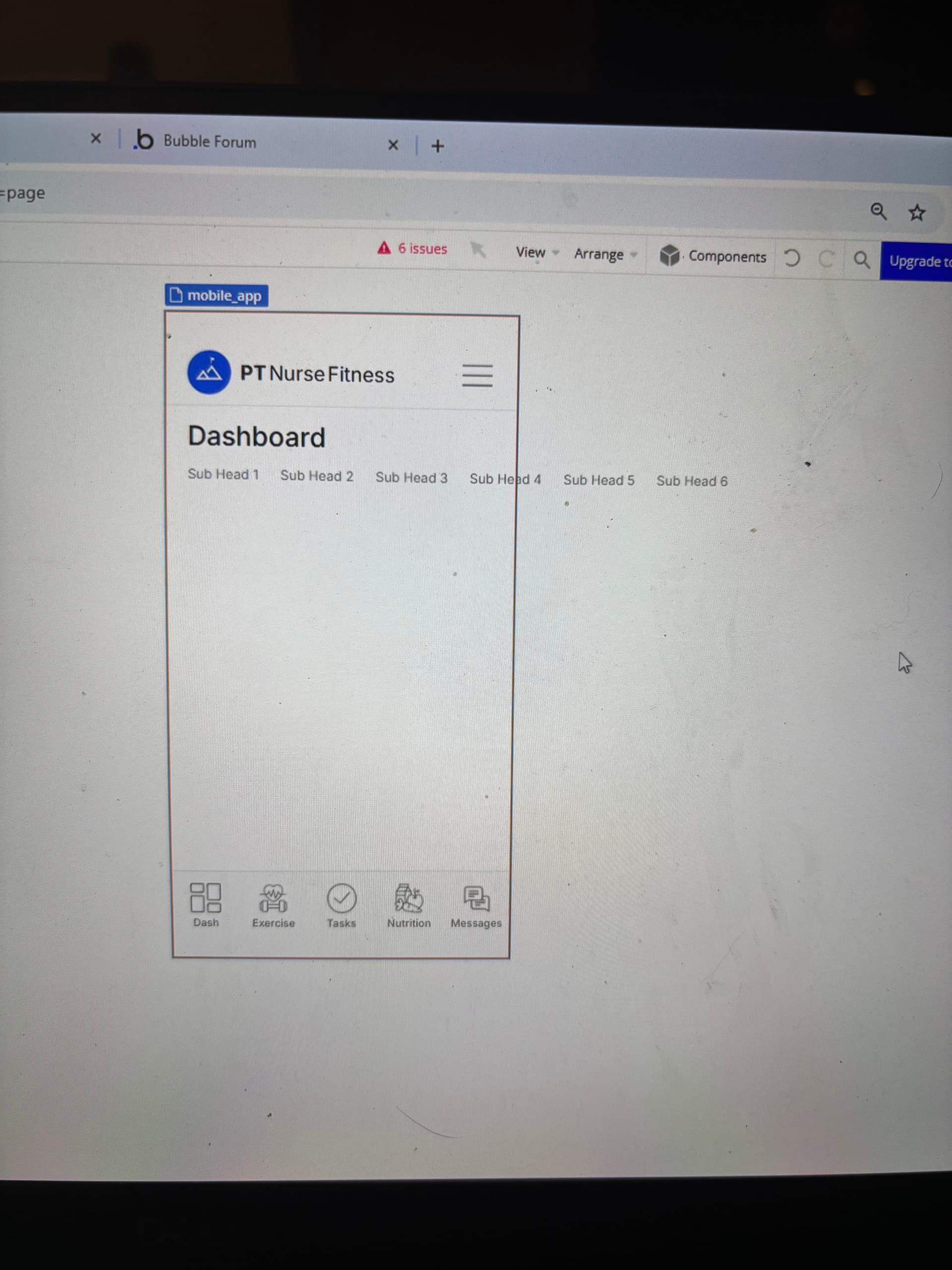
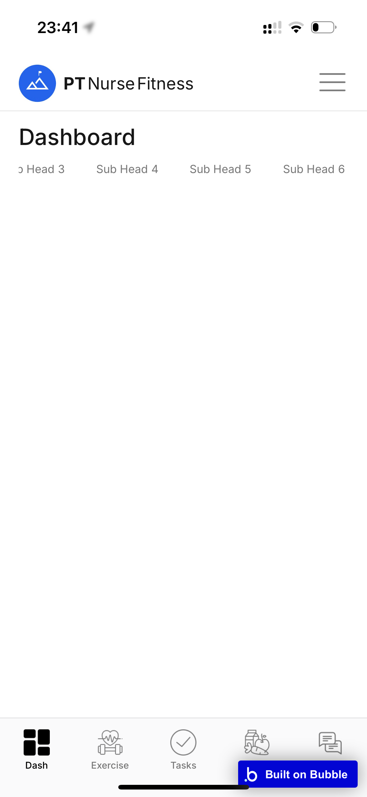
I’ve added as you’ve suggested and it looks close to working now. Is it being restricted by a parent group you think?

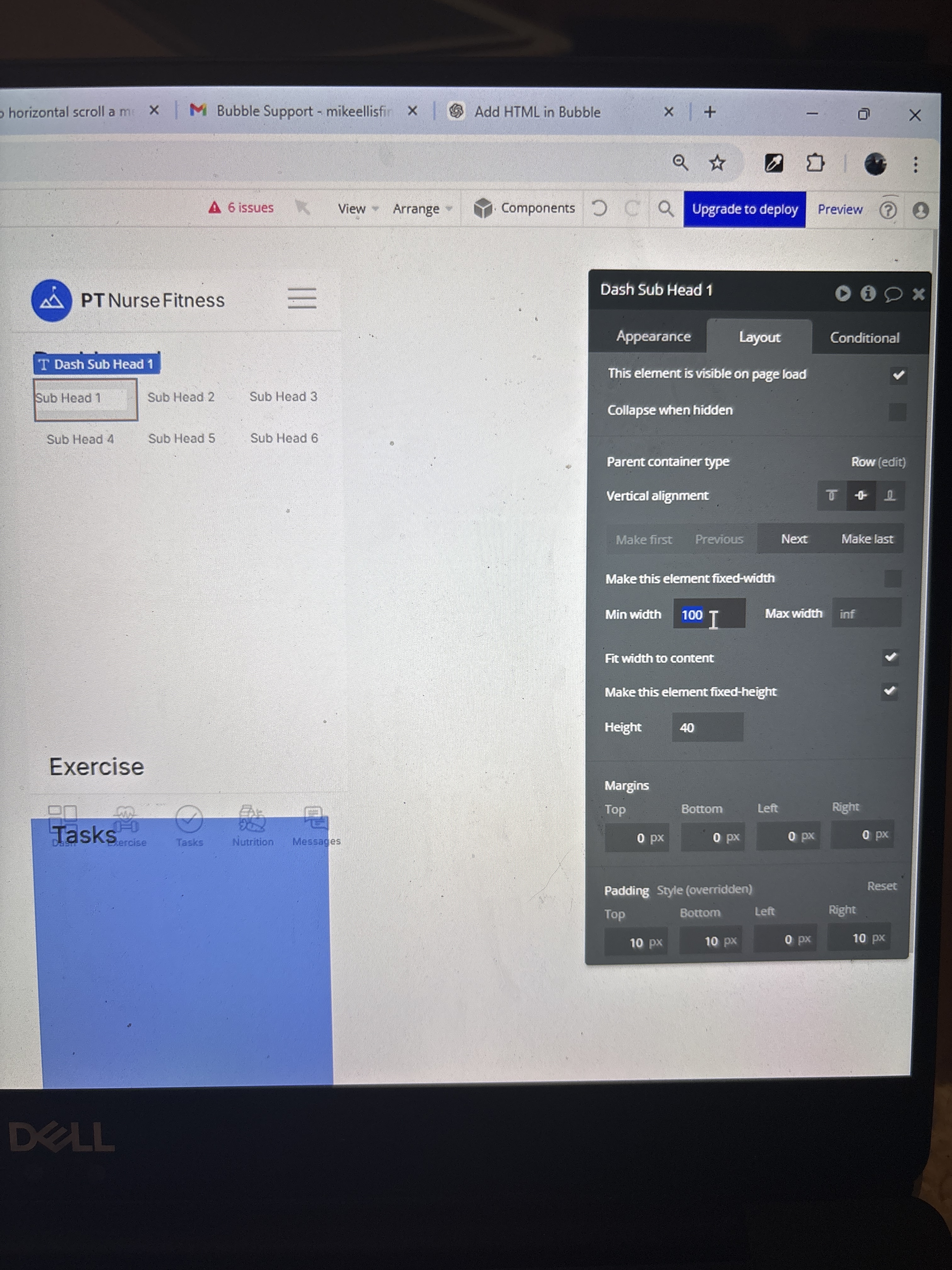
Ok it works, but only when I increase the minimum width of each of the menu text boxes.
Otherwise it abbreviates “(sub…)”
Is there a way we can get this fixed so the fit width to content check box works again? This will be helpful as I’ll use this technique in a number of places across the app.
Thanks for the help so far!
1 Like
put a max height of 40 on the main group those little ones are sat in and position that main group row to left.
1 Like