Hello everyone, So I’m building a social network. I got the pages done. I’ve replicated almost all the pages and made a mobile version of the page. However, the index page is something I would like to be able to adapt to any screen without a separate page since it takes the most work.
as you can see these repeating groups have a lot involved and I don’t want to recreate it for mobile. I tried using max-width settings etc, I can seem to get it to work. Any ideas?
The issue is the post the user made looks good on the computer. But when I launch on mobile, the repeating group (users post) is all messed up and not inline. How can I make it look good on pc and mobile when it is a large repeating group? I don’t want to make a separate page for mobile.
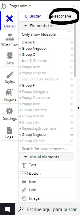
Without seeing it, or knowing more details, it’s impossible to say, but sounds like you’ll need play around with the responsive settings in the responsive editor to get things to display the way you want them to.
It can be tricky at first to understand how it works, but with a combination of trial and error, and using the bubble reference you should be able to get your head round it.
You’ll need to experiment with minimum width setting and margins until it works how you want it to on all screen sizes.
If you’re referring to the position of the heart and speech bubble then make sure you group them together with the ‘11 hours’ and blue icon (so they’re all in one group) and make that group fixed width. That should keep them all on the same line.
As for the main image, make sure that’s fixed width as well.


 >
>