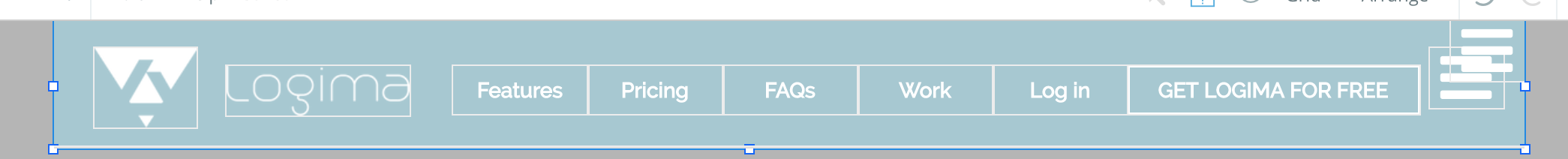
I have two elements set up next to each other inside of a floating group. This is because I couldn’t get the text and the picture to stay at a central fixed position. But, in mobile view obviously these two elements “crashes”/ don’t look very pretty. Is there a way to make the picture move it’s position on top of the text when the screen size is broken down to a smaller size than desktop size?
Recently discovered Bubble and having a lot of fun with it, still learning a lot about it (coming from Shopify and Squarespace). Thanks!
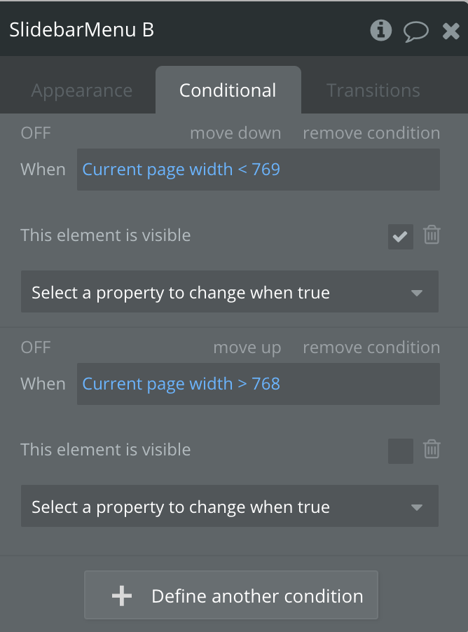
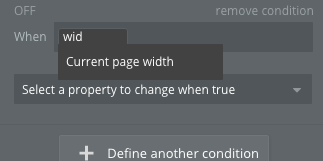
The Current Page Width condition might help you here. You can insert a width in pixels, and elements can change properties based on it. You might have to use several identical elements here, as Bubble doesn’t allowing for ‘moving’ it.
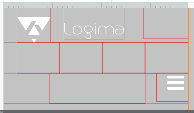
You can set up a group with Elements in a ‘wide’ design and one with a narrow design, and hide/show them based on the page width for example.
Great! Thank you. However, I am still a little bit stuck. I’ve entered “Current page width < 1200” Then I tried to create a new condition but no conditions that shows that I can hide the element?
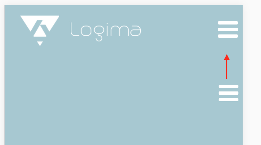
Perhaps I am going off topic right now, but I am struggling with fixing the position for the hamburger menu for mobile screen. I want it to evenly align with the logo, but even though I have duplicated the hamburger icon, and have conditioned it as
Without seeing the code I would suggest two things- firstly, the responsive engine doesn’t tend to play nicely if you have elements overlapping each other, so make sure nothing is overlapping (even with empty space/borders).
Secondly, I’m guessing you’re hiding the various buttons using Conditional options as above? If you do this, the responsive engine still considers them there even though they’re invisible, so the hamburger icon will wrap to the next line. What you need to do is use the Hiding Rules within the Responsive view of the design page. Click an element and choose Add hiding rule, to make it hidden when the page width is below something. Doing it this way will collapse its width so other elements will be able to take up their space.

