Hello Bubble forum and congratulations for your great support here, it is really amazing!
I went through the forum but I still have a question about the responsive viewer. I am struggling to maintain the structure and appearance of my page which is originally designed for pc screen when I switch to any other screen.
Firstly, If I check the box “cut off content if it is too tall” will it still be shown in all if the mobile user slide right?
Secondly, I do not want my buttons to become two lines to fit in the mobile version.
Generally, can I have advice on how to have 100% the same content but in the zoom out version when in mobile?
My desire is to make a webpage for my project and then make this project a mobile app, what do you suggest for this in terms of bubble design in order to move fast and not lose so much time in design that changes in each viewer and settings?
“cut off content if it is too tall” will hide the text and will end it with ‘…’ if the text is too high. A lot of sites do this when it’s a long text.
The way you control the buttons is with the minimum width. If the text goes on 2 lines, that means the min width is too low, so you can make it larger, and then the algorithm will make sure you never go below that limit.
Hello Emmanuel,
your response rate is really amazing and effective, wow!
Thanks for this, I fixed it BUT I have two buttons next to each other (Sign up and Log in) and in mobile version, Log in goes above Sign up), and in general, the space in between is changing according to the layout, how can I adjust it to be proportional and also maintained in mobile version?
What don’t you share a link to try?
Okay, I will but let me first make some progress, maybe I will send one by the day next tomorrow.
Thank you
This is the public copy of my app.
I need help and guidance (i will learn from your interaction) in 3 things:
- [Section 1, buttons sign up and log in] Maintain buttons in mobile view without having the one above the other.
- [Section 3, Question 3 from the left] Maintain the exact spacing in between + empty line for new paragraphs in text in justified text.
- [In general] Some standard settings for portable design (for all layouts etc)
 You’ve got a typo “beautiful bitches” or I hope it’s a typo.

Fortunately I live in a country with beautiful beaches 
- Place your buttons in a group and do your settings from there. I usually keep mine a fixed width.
- This is a result of having text justified.
- Have a look at https://bubble.io/documentation > Using conditional formatting. I try to work in blocks of 360. I know the responsive viewer has 375 but for instance my S7’s screen width is 360. If my text or other elements is wider than 360 I narrow the min width down to 360 and sometimes have a max width of 100%. Depends on what it is and what I’m want it to do.
Have a look at this app to see what I mean.
Yes it is! My colleague was making fun of me and it made it lol
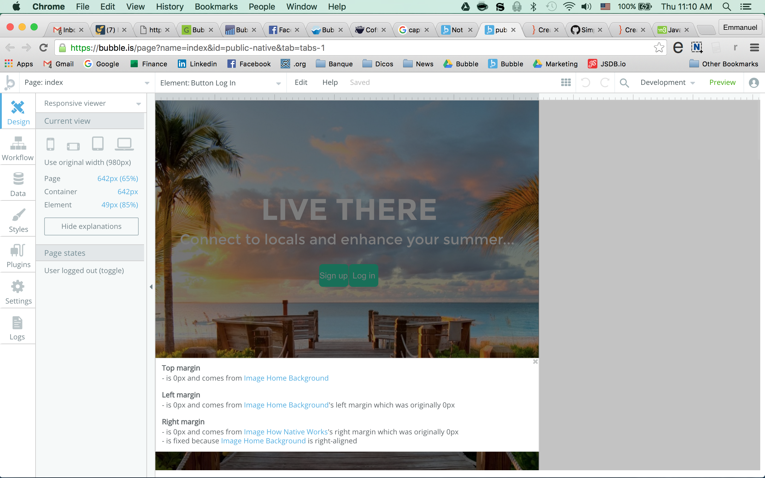
Your issue here is that you have elements that are overlapping. Instead of having an image and put some elements on top of it, you should have a group, and have the elements inside, and make the background of the group the image. That will be much easier.
See the screenshot attached. Why i click ‘explain box margins’ on the buttons, it’s says 0, because the element it’s using the calculate it is the image below.