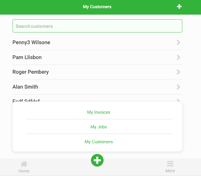
Guys, I have a very annoying problem. My repeating group displays a list of 30 Customers and each customers name links to the customer details. all perfect.
But, as I move down to the list of names, the mouse curser starts to not show the pointing finger so I am unable to click through.
This is very buggy, for example, sometimes I can click on the 5th name, sometimes I can not. Sometimes the mouse curser only turns into a pointing finger at the top of the name link, and not at the bottom!
It get’s stranger …
I tried placing another identical repeating group beneath the first and this made the first work perfectly, all names were clickable but the bottom one behaved as the top did.
This behavior suggests that there may be some other hidden element on-top of the repeatingGroups henceforth blocking mouse input on the element. But we can’t give you a definitive answer without more context. Perhaps if you could create a new bubble app, copy the page over, allow editing and give us a link; we may be able to better identify the root cause.
Thank you guys, you actually made me realise that the footer nav is covering up the links, but not sure how to solve this because the footer nav is inside a floating group?
Obviously the footer links are closed when not active, but I cannot ‘hide’ them because otherwise the whole footer moves up. The effects of the whole footer moving up is that if you click on a nav link, such as ‘more’, instead of the links popup up, the whole nav bar pops down, very ugly UI!
So I guess the question becomes, how do we hide the popup links without disrupting the footer nav bar?
I have had this same problem before. I’ve tried using “collapse when hidden” option, but as you have pointed out, it ends up with the nav bar moving up and down the page. The most logical solution I’ve come up with that doesn’t involve loads of bloat would be using a GroupFocus element for your menu. The only limitation though is that it does not have a responsive width and hence cannot have its size changed dynamically. That said though, for your use case it should work.
Steps:
Create a long group that holds the + button, set it to have a fixed width. This group will have to precisely match the width of what you want your GroupFocus to be.
Convert your option list group to be a GroupFocus
Set the “Reference element” to the group you created in step 1
Set the “Offset top” to be negative the height of the group you created in step 1 and then negative the height of your GroupFocus (Eg. If the group was 100px in height and the groupFocus was 150px in height, it would be -100 + -150 = -250)
Move everything around so that the nav bar looks like normal again
Once you have done this, you will notice that the GroupFocus becomes difficult to edit. Every time you want to edit the links inside of it, you must reset the “Offset top” option back to 0 to see it again
Did you know that a GroupFocus element is not mobile responsive, it remains the set number of pixel width regardless of view size. So, back to square one, how on earth do we have a pop(up) navigation without covering up page elements?!
Yep. I did mention that my solution is unfortunately not responsive. But I would have liked to have thought that it would work in your situation? Perhaps you could make the GroupFocus less wide.
If not then I do know of another solution that will work, except there is a lot of set-up involved and extra reusable elements required on every page. It’s a bit difficult to portray, but I will attempt to explain myself:
Create a floating reusable element for your menu options:
Add it to the bottom of every page, just above the navigation bar. Make sure to set this element to NOT show on load
Create a new state for the navigation bar called something along the lines of “doOptions”. Make it a Yes/No state
On the + button, create an on-click event to set the doOptions state to Yes
For every page you have put the nav bar on, create a “Do when condition is true” event and make it run “Every time”. Set the “Only when” section to when “navbar doOptions is Yes”
Inside of this event, make the options element toggle between show/hide.
Then set the doOptions state back to “No”
I must admit this is a rather overcomplex solution to your problem, but it’s the only responsive one I’ve found to consistently work
That is very kind of you to explain this method. I can’t use reusable elements because I have a single page app and need to make the navigation links refer to groups on the page where the navigation lives. It’s hard to explain but it goes like this;
Link > refer to index/customState > show group to open.
If I am creating a reusable element the customState is not available because I am not on the index page where my customStates live. There may be a way around this but that might become complicated too?
I’ve decided to just make the FloatingGroup small and not have it responsive. Your solution will hopefully help others though.