Hello everyone,
I’m looking for some help with a pagination issue. I’ve implemented a simple pagination component based on several tutorials (using Toolbox plugin), and it functions perfectly on larger screens.
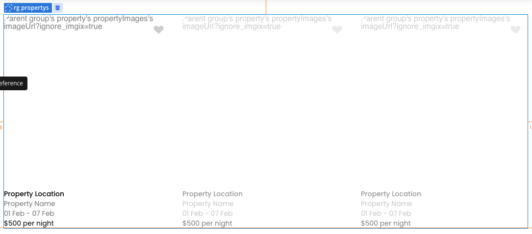
However, on devices with smaller screens, the pagination items (the groups) start to overlap, breaking the layout.
I already tried a simple fix using a conditional to reduce the number columns based on the screen size. The problem is that this solution doesn’t interact well with the “next” and “previous” navigation arrows; it seems to break their logic.
Does anyone have a better solution or suggestion for how to handle this? How can I make the pagination responsive without breaking everything?
Thanks in advance!
*Image blurred for confidentiality
Dude first, your condition to “is” the device will need to have exactly the 320px, which is rare, try using ‘<=’ and ‘=>’ to set the ranges and fit better.
According to Bubble has natively pagination, only thing you need to leave fixed the number of columns and rows, leave them and you can use the action of ‘show next’ and ‘show previous’.
You don’t need a plugin to build a paginating repeating group.
The layout for your repeating group is likely incorrect. The 1st child of your repeating group should have a min width in the range of 370 - 390 px and your repeating group should not have fixed number of columns checked, rather set the min and max width of the 1st child of the repeating group and set a maximum width of 1080 or whatever is suitable for your use case on the RG itself. You can either use custom states or url parameters to control the pagination. If you give me the desired layout (ideal number of cells) per screen size I can probably tell you exactly what the setup should be for pagination to work correctly.
You don’t necessarily need to work with a fixed number of columns.
Also, in the current situation, what seems to be wrong is the minimum width of the containers inside the repeating group.
Below is an example of an app I built similar to yours, where a fixed number of columns wasn’t needed:
How the repeating group looked:
Repeating group settings:
And the container settings inside the repeating group:
Therefore, you only need to set the minimum column width in the repeating group, which lets you control things better in conditionals as well.
See if this helps.
Oh sorry, i didn’t even notice it but that was a little “stress test” just to see how the conditionals works in this case. Ty for your suggestion!
Oh i will try that, every tutorial that i found used Toolbox. The ideal layout would be 12 cells, 3x4 in desktop and 10 cells, 10x1 in mobile.
I think its only Toolbox (plugin) that needs fixed rows and columns. I will try your solution as well, ty very much.
1 Like
Just to add some additional context, this is the style of pagination i’m using