
Me again. The bar corner radius option does not seem to work. I simply pasted a new “Chart -bar/line/area” onto the page and changed the bar corner radius but nothing changes on the chart. Am I missing something?
How do I move this label down to center it vertically? When I use a horizontal bar chart, the vertical offset for the label moves it horizontally, not vertically. I’m on the latest.
Hi @Atomily thanks for reaching out again!
Me again. The bar corner radius option does not seem to work. I simply pasted a new “Chart -bar/line/area” onto the page and changed the bar corner radius but nothing changes on the chart. Am I missing something?
We just pushed a fix for this one. Once you upgrade the plugin to v4.38.142 the issue should be fixed.
Can you please take a look and confirm it’s working properly on your end?
When I used a 100% stacked horizontal bar chart and set “show data labels” to yes, the chart fails to render and I get a whole lot of error messages in my console. As soon as I change it to back “no” it works.
We had a tough time reproducing this issue but might have pinpointed what’s causing the errors on your end. Please upgrade to v4.38.143 and let us know how that one’s working for you!
Hey @treb.gatte good to hear from you!
That’s strange, the labels for horizontal charts should automatically be vertically centered and we’re not able to reproduce that vertical alignment issue. See here:

Can you share a link to an editor page isolating that chart you’ve taken a screenshot of?
Thanks!
I found if you have text in the Unit before Label field, you get this issue. I removed the text and the label centered vertically.
Update: It’s doing it again. So, not sure what’s causing the vertical misalignment. It’s happening in FireFox/Chrome/Edge.
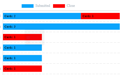
So I have to make a RG of my data first like a table? The RG datapoints are then transferred to the List Calculator and then to the Graph? Does the RG need to be visible for it to work? Can the list calculator not get the data directly? Why does it have to go via the HTML ID?
Also I am trying to mimic your example but fail:

In your example on the right you sum with a value in a field. In my case I need to count ticket events, but I need to count them conditionally, i.e. submitted ticket events on the one hand and closed ticket events on the other hand.
Now that I have grouped my ticket events by day, how can I filter the items I want to count?
Following up on this @help6 I managed to make my table by using filtering etc. Now that the table with the aggregated data is ready, I added the ID attribute in each table item, I added the same attribute in the advanced list and then these values into the graph, but there is no data. Inspecting the advanced list shows there is no data. Please help.
@umiumansa Apologies for late response, Thank you for reaching out to us. The team is currently trying to figure out a solution on your issue.
Hello guys !
Amazing plugin, it’s what I was needing !
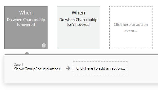
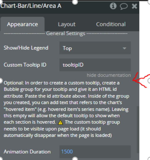
I have a doubt, I have a chart running inside a repeating group, but I want to use a custom tool tip to show more information.
When I try to found the information form the chart in the group created, I cannot found the chart. And the area I user the chard is small and I cannot show the group inside the repeating group, I need to show on the page.
How I can do it ? It’s like the team chart in the demo dashboard 2, but i need to put a tooltip.
1 Like
Hi @rafabitente , thanks for reaching out! I appreciate the kind words about the plugin – definitely great to hear that customers are liking the plugin. I’ll look into the request and get back to you within one business day!
Hi @umiumansa can you try to uncheck “Do not skip empty groups” because it will load all the days even if they are empty and you can just filter the end date in the “do search of tickets.” If the data is still not showing, please reset your grouping by “removing this grouping” and set your grouping again.
For hiding the RG, you cannot hide it but you can keep it visible and make it really small (1px by 1px height and width) and hide it behind another element.
Hi @treb.gatte thanks for reaching out! I tried reproducing the bug but I wasn’t able to. Could you send me (email)/PM me (forum) a link to your editor so I can take a look? Make sure to add alex@techblocksco.com as a collaborator or temporarily set the permission to “Everyone can Edit”
As you can see the label is vertically aligned. We experimented with the settings, but we weren’t able to replicate the misalignment that you’re encountering.
1 Like
Hi @alex4 ,
Great job on the plugin. I’m just looking for one feature that I’m not seeing and want to know if I’m just missing it in the documentation?
I’d like to be able to scroll and scale line graphs “TradingView” style. I’ve noticed that this plugin has the feature:
Bubble | No-code apps (bubbleapps.io)
But I’d prefer to go with your solution if it has this capability?
Thanks
1 Like
Hi @melissa7, FYI we’ve added the ability to creat Pie/Donut charts with section labels including only the section name.
You can see an example at (top right chart): techblocksco.bubbleapps.io/pie-charts
Let me know if you have any questions!
2 Likes
Hi rafabitente, thanks for reaching out! I appreciate the kind words about the plugin – definitely great to hear that customers are liking the plugin.
Based on the info you’ve provided; this should help with your setup/resolve your issue:
Output

Steps
Editor
In order to obtain the desired result, you have to put your chart in reusable element with Groupfocus. Screenshot below.
Repeating Group – Contains Reusable Element

Reusable Element - Contains Chart and Group Focus
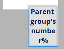
Workflow – Contains workflow to hide and show Group Focus
let me know if this works for you ![]()
Hi @therealbruce , Thank you for the kind words about our plug-in and for the feature request – will add it to the backlog and keep you posted if/when we build it out! How urgently do you need this request and is it a “must-have” for your use case?
2 Likes
Hi @alex4 ,
We are currently using your chart plugin on our website and we are really happy with its performance and features. Thank you for creating such a useful tool for the community!
I do have a question regarding the customization of the tooltips. We are using a 100% stacked bar chart and we would like to include the percentage value in the custom tooltip for each segment of the bar. Can you please advise on how we can achieve this?
Furthermore, we currently have data labels enabled. It first displays the percentage value initially and then the regular count value on hover. Is there a way to modify this to show both values in the data label?
Thank you in advance for your help!
1 Like
Hi @nest ,
Thank you for reaching out to us and for your kind words about our plug-in. For your question we’ll investigate this matter further and get back to you once we have the solution for this.
hi, I’m Nam, I’m from Viet Nam
Can you tell me if your plugin can create charts for CAC 40 and Dow Jones
Hi @nest,
Thanks for patience!
Based on the info you’ve provided; this should help with your setup/resolve your issue:
Should you have concerns let us know anytime!
hello @minhquan.duong
We are currently looking into it. I’ll get back to you as soon as we have the answer to your question.