Responsive Header Weird Behavior

I am trying to get a header to function properly as a responsive design. I understand the responsive design ideas. I had the header working correctly. Then when copying and pasting with workflows to other pages ( Yes I know about Reuseable Elements ) the responsiveness started to have a really strange and for me, unexplainable, behavior.

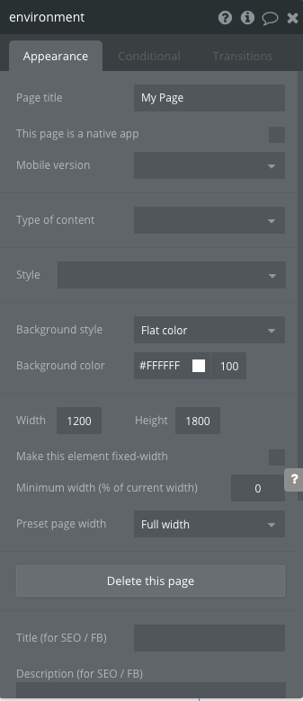
This is the page setup


The floating header setup

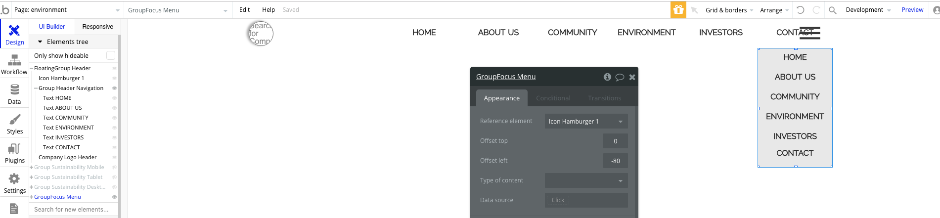
This is the group inside of the floating group. This group has conditionals to show/hide based on page width.


15%20AM

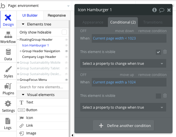
My hamburger Icon set up with conditionals


45%20AM

And the Logo Icon set up

The weird behavior is that everything works as it should, except when the page width is between 969 and 856 px the hamburger icon is pushed to a lower level, but above 969 and below 856 everything is as should be.

Notice the numbers in left hand side of grey group…Below is 1025 page width, and the responsiveness is as expected.

Here the page width is below 1024 but greater than 969 (working as expected)

Here it is at 969 and not working as it should

And finally here it is again at 855 and working as expected

As could be seen in the set up images there are no other elements in the floating group besides the group for header navigation containing text elements. This group is set to be not visible when page width is less than 1024…it functions fine.

There is the company icon in the left hand side. Additionally there is the hamburger icon which is set to be visible when page width is less than 1024.

The only other element is the group focus which is the menu that shows when the hamburger icon is clicked. I don’t think this has anything to do with the responsiveness issue of the floating group header, for two reasons…one, it shouldn’t has it is not contained in the floating group and two, I tested it by deleting the group focus and the issue remained.

Any ideas of what might be the reason for this? Others experience something similar and found a fix, or is it a bug?

1 Like

Not sure to understand all your setting. But try this:
For what I understand, is that your hide your group header navigation under 1024. That’s ok And you show your hamburger icon. Add this icon into a group and set your conditionnal into this group.
Make the group width not fixed and use the remaining space between your company logo and right end of floating group. (I guess will be around 960 when I look at the menu group).
Normally, responsive work better if there’s no “space” between group for example [groupA]_____________[groupB] may cause issue while [groupA][_____________groupB] will not

Thanks @Jici, I appreciate the input. I actually didn’t get to try it out as I needed to adjust spacing between elements and after making the width of the group containing the elements, the issue stopped occurring. I thought the width of the element may have had something to do with it.

I believe your suggestion would have worked as in the past, others have mentioned the use of groups as “spacers” that helped with responsiveness.

I do actually have another issue now that you may be able to shine some light onto. Since getting the header to work properly, I decided to copy with workflows from the page into a Reusable Element.

After creating a reusable element with all the same settings and putting the reusable header onto the page, the responsiveness is not function the same way. If a user is making the viewport or screen width larger and smaller the header doesn’t respond, except to hide elements. So, the real issue is that the hamburger menu icon or the navigation text doesn’t respond and move across the element as the page changes widths.

All other elements on my pages respond as I increase or decrease the width of the page, but this reusable element header needs me to refresh the page after I changed the width to reload the page and have the hamburger menu icon or navigation text be in the correct location.

Any ideas as to why this might be happening?

Whe you use reusable element, you need to check two things: The page itself where you add this reusable element and the reusable element itself (and it’s content).
Also, even if you have not set fixed width into the reusable element, when you add it, you also have to set if this element is fixed or not. And finally, you also have the page itself that you add the element that need to be responsive.
So if you have copied to reusable element, I guess that they are correct. Now check the main setting of reusable element, go in the page where you insert it, check the setting of the reusable element inserted and finally, check the page itself.

Thanks @Jici. I had checked all those places a couple of times to ensure everything was set correctly. None of the elements in question were set to “Fixed Width” except the group inside of the floating group with navigation text. I had created a couple of different “test” pages as well to play with the differences of fixed width or not fixed width.

Was just weird and a bit annoying to not have luck with a reusable element, as the header is one of the best places to use them. Instead I had to just copy and paste into each page (luckily not many) for the header to be responsive.

I haven’t had any luck really with reusable elements having the same responsive behaviors as the elements when created on page. Spacing is off and things get jumbled or mixed up. It is really odd. I have the same issue with a contact form. When I created on a page everything was fine. When I copied it into a reusable element the formatting was off. I even tried building it in the reusable element from scratch and still didn’t get the same responsiveness.

It’s hard to tell. Most of the time I use reusable element for header and I’m able to get responsiveness to work fine. But I’ve never copied from something that already exist. But there’s a lot of thing to check to make this work so sometimes we can search a lot before finding what is causing issue.