Hi, I haven’t been able to find any document that can help me make a collapsable sidebar menu that “pushes” the main content to the right when it appears instead of just covering it.
The behaviour I want to achieve is something like this:
So if you see, it’s not a regular Slidebar. Any ideas ?
Put a group on the page that is the same width as the side menu and label it ‘side buffer’…the side menu should be a floating group so as to ‘cover’ the ‘side buffer’…If you page is 1200px for example, and the side buffer and side menu are 280px then you have another 920px of space…what you do is to have a group that you label ‘container’ to have all your content.
Make sure responsive settings have the ‘container’ set to collapse width and set it to something high like 4200px.
Then when the side menu is supposed to be hidden, you should also hide the ‘side buffer’…this should do the trick…
Another way is to have a group called ‘container’ that you put a left margin set to 280px using conditionals when the side menu is visible, and make the left margin 0 px when the side menu is not visible.
Either method works, but I forget if there is a bit of difference between how they function…If I remember correct the latter will ‘push’ the content off screen while the former will just readjust the content to fit if your responsive settings are done properly.
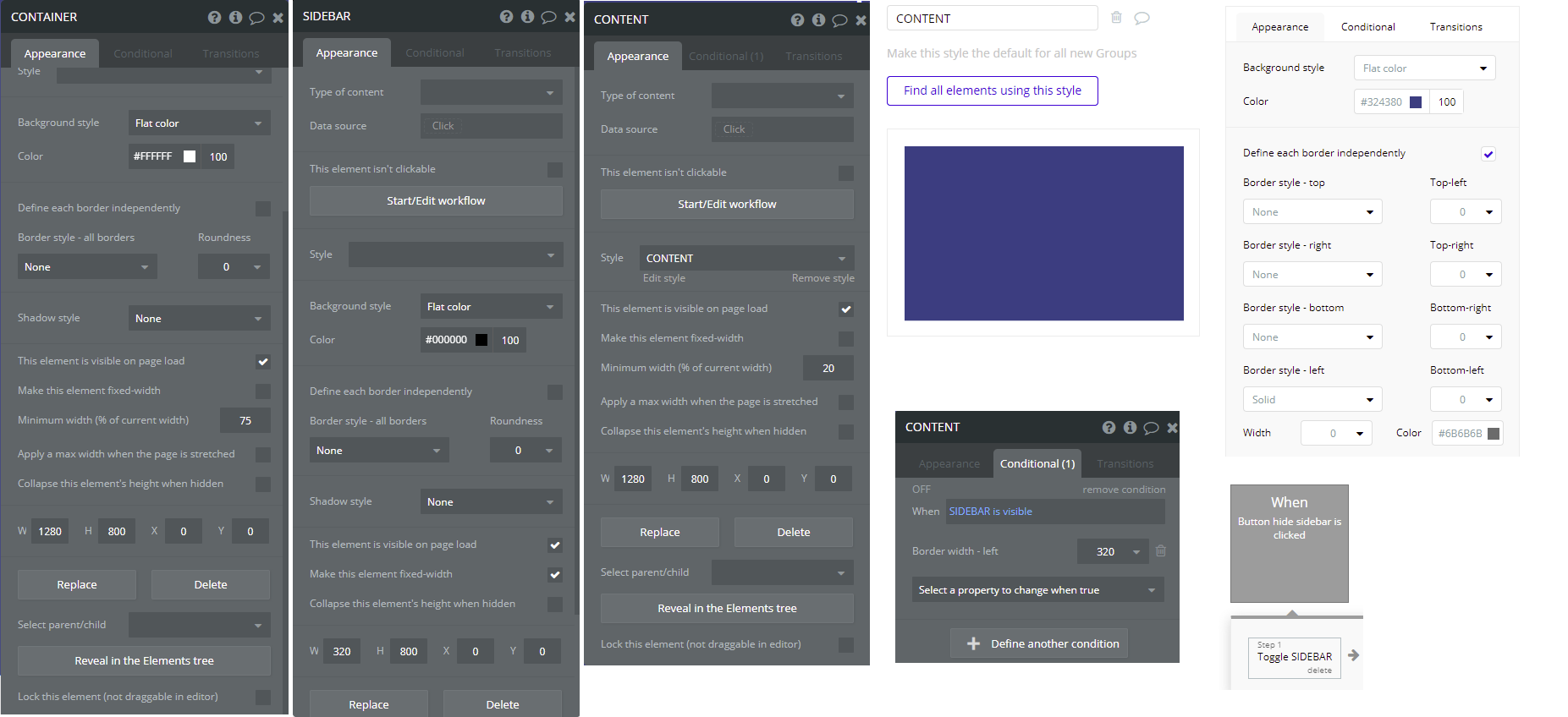
Thanks a lot for your tips, I was able to do it creating a CONTAINER group of 1280px width and putting inside of it 2 sub GROUPS (SIDEBAR 320px width and CONTENT 1280px width). Then I manually gave a solid left border = 0 to the CONTENT GROUP with the conditional of border = 320 when SIDEBAR is visible. Finally I created a workflow over a button so when it is clicked it should toggle the SIDEBAR.
This are the settings of each element so you can test it by yourself.
hi, thanks for your input. What you saying is that everything should be together inside containers for anything to work properly, is that correct? Also, i noticed with bubble, if its not done in the beginning, seems like you have to start all over to get it right…
Not necessarily. I use containers only when the design requires it for the responsiveness to work properly, and to get it to work properly, in some instances you would put things into groups together and in others you wouldn’t need to. Every design calls for something different potentially.
No. It is possible to make changes later. I performed a job for a client taking 25 pages and making them all responsive.