Stretch RG vertically with CSS

Hi all,

I’ve been working towards vertical responsivity for some time now. I managed to use CSS to make my Repeating Groups stretch perfectly to any viewport. But, the problem is they only stretch the RG image, and not the actual list (the data cuts off at the size of the RG set in the developer, even when it stretches to a larger viewport).

Here’s what I have.

First, I change settings to allow me to add ID’s to elements.

stretchRGsettings

Now there is an option at the bottom of the element editor to set an ID. I set the ID of my RG to list

stretchRGlist

Then I drop an HTML element onto the page.

stretchRGhtml

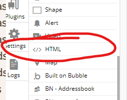
and add the following code into that HTML element

stretchRGcss

this identifies the element ID (list) then sets the height to the entire viewport (100vh) minus the size of the footer (175px)

It also makes sure the RG doesnt shrink further than the smallest size I want (min-height).

Perfect, problem solved.

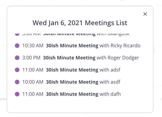
The result is a RG that stretches with the viewport like so:

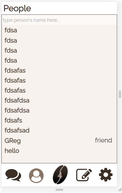
The problem is, this list contains more data after “hello”.

The list stretches, but the data does not.

This makes this solution useless…

I’ve tried many other solutions, from invisible groups, to herogroups (plug in) to zeroqode’s plugin, and others.

Zeroqodes plugin is great, but suffers the same problem as not stretching the data (and also only deals with percentages which doesn’t work for matching groups of different starting sizes. Anyways, if you want to stretch non-repeating groups, Zeroqode’s plugin is easy to use, its here: Dynamic Height and Width Plugin | Bubble

Ultimate Toolkit’s Herosizing is great for moving elements around based on viewport height (css and zeroqode do not move elements when they stretch (they stretch on top of each other)). This is how I managed to get the footer to be at the bottom of the page no matter the viewport. Its limitation is that it cannot stretch elements. Here is the tutorial for hero sizing: Toolit Kit - Hero Sizing Element Video Tutorial )

In this thread a few people attempt to tackle this exact issue I am experiencing: 🔥 Classify 4: A tiny plugin that brings CSS classes and + - #100 by boston85719

Unfortunately, I either do not understand their solutions or, as I believe, they are not good solutions.

Anyways, my problem is that I need to stretch not just the RG but the data inside it. Does anyone have any ideas about how to fix this? Is there something I can add to the CSS to stretch the RG properly?

Thanks!!!

P.S. bubble please make vertical responsivity. You can detect viewport size, you can size groups, put that together and you have vertical responsivity! You have horizontal already, screens differ in height as well. Seems like a pretty important feature. The amount of hours I’ve put into this app for it to become useless in the end because it doesn’t fit any phone is crazy, and browsing the forums I can see that countless people have been dealing with the same problem for a long time. Just a suggestion.

Set the repeating group to be single row single column with datasource set to full list. Then when you set up your CSS make sure you also accomodate the CSS to add a scroll bar so that when the content of the repeating group is going to require a taller repeating group, it will show a scroll bar and when it doesn’t it won’t show a scroll bar.

Scroll bar is on the group that is the container of the repeating group.

Also, might want to set your repeating group to have a max-height as well so it ensures it doesn’t stretch according to the extra data.

If you are interested to learn more about dynamic heights for responsive design please feel free to reach out about a 1:1 training session and we can cover all the tricks that make this possible.

I use this in several of my templates and for different purposes.

This messenger template looks perfect on all devices and all orientations due to the use of CSS.

Also this popup in another template has adjusted the height of the repeating group as well as the popup so I can show a full list but have a scroll on the RG that is responsive to the list of items in the RG

Screen Shot 2021-03-16 at 2.57.33 PM Screen Shot 2021-03-16 at 2.57.24 PM

I set the max height to show only half of the 6th item in the list to show there are more, but did not visualize the scrollbar so to have the design and look I wanted.

Thank you. You’ve been a huge help as I work through this.

So I managed to fix the problem by setting the group to Full List and adding a single line of CSS.

overflow-y: scroll !important;

So, my CSS now is:

< style>
#list {
height: calc(100vh - 175px) !important;
min-height: 468px !important;
overflow-y: scroll !important;
}
< /style>

(btw I set this code not on the group container as you recommended, but on the repeating group itself).

This sets the height to the viewport minus the footer, makes sure it doesnt shrink more than I want, and stretches the data when the viewport is taller (and allows scrolling).

Problem has been solved!!!

However, it seems whenever you fix one thing something else always goes wrong :stuck_out_tongue:

In setting the repeating group to full list, bubble acts as if the full list is being displayed even when its not. The result is that anything below the list (in this case my Footer) gets pushed down as far as the list would stretch were it visible. So if I set the footer to the bottom of the index at 640px, but I have a list that contains enough data to stretch to 900px (were it to be stretched) then when I load my preview the footer is down at 900px, even though the repeating group is not stretched out to display all its data and actually be visible at 900 px.

Have you come across this, and managed to fix it?

Here is a video of the problem to help show what I mean:

As you see the Notes list is fine because it only had 3 times, but the Person List pushes the footer because it has more even though they are not visible.

If this can be resolved, then we have a solid solution to the original problem in this thread (I know you have a solution too that is somewhat different, but I’m curious about going this way because it is very simple for someone like me with no CSS experience to understand).

I’ve tried adding CSS for the width of the group

width: 100vw !important;

This adjusts the width as I’ve played with the value, but it doesn’t stop the footer from being pushed.

put a max-height into your CSS I suppose would work

that was a really good idea, I was so hopeful it would work but it didn’t do anything.

even if I set the max height to something small like 300px, it works at limiting the height to 300px, but the footer still gets pushed based on the groups (not shown) data.

No idea why this is happening, I’m at a total loss.

This topic was automatically closed after 70 days. New replies are no longer allowed.