It seems that the responsive engine takes the spacing amount at the “Use original width” and applies that percentage to the smaller device screen sizes (tablet, mobile landscape, and mobile portrait). But that’s not why I want and there’s no way to override it. I want to define how wide it should be at each screen size (>=1200px, 1199px-769px. 768px-668px, and 667px-381px, and <=380.
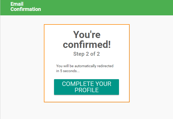
For example, notice the “You’re Confirmed” container in the screens below:
Here is my page at 1200px
Here’s the page at the tablet size in the responsive viewer, but I want it to be wider and there’s no way to make only this screen size wider without affecting the smaller screen sizes. I need to have an option to define breakpoints and different widths at those breakpoints.
Mobile Landscape
Mobile Portrait

Another suggestion related to being able to define different settings at each break point.
At every break point, except the mobile portrait size (<=380px), I want the “Login/Sign up” to be right aligned, but below 380px I want it to be centered. Currently, there is no way to do this.
=1200px
=768px
=667px

<=380 – I want the “Login/Sign up”, and site name, centered at this size.

Isn’t this what the screen width condition does? I’m using the screen width condition to show and hide different groups that look exactly the way I want them to for each breakpoint range. So, I have one set of responsive behavior for big screens, another for tablets, another for phones. Is this what you’re looking for? Or maybe I misunderstood?
I shouldn’t have to copy the “Login/Signup” multiple times to show it differently at different screen sizes. Using hiding rules in Responsive view, or Conditions in UI Builider view, work great if you want to show completely different elements, but shouldn’t be necessary to show one element/group differently at various break points.
Here’s an example showing a menu on the left and a sidebar on the right at desktop size, but both are centered at smaller screen sizes.
SOURCE: http://www.w3schools.com/css/css_rwd_mediaqueries.asp
Breakpoints are a bit tricky when it’s about having them in a visual interface. We’ll think about it, but not sure we’ll have a quick turnaround on that one.


