
Hi all.
More than a year has passed. Did anybody find a solution for making a nice looking table with header (not using excel plugin) that works perfect on every screen?
2 Likes
@emmanuel Can you please advise which element you used to create the datagrid in the “App Data” section?

If this is a repeat question please pardon.
1 Like
Any solution here? Also would like to allow user to move columns and add/remove columns.
1 Like
The grid is hard coded as it’s in the editor
1 Like
Thanks for the response @emmanuel. 
1 Like
Is it JS that could possibly worked into a plugin?
1 Like
The Coaching Bubble have a solution in their archive - “Quick Trick: Create a Header for Single Column Repeating Groups”

5 Likes
I don’t see that resource. Can you post a direct link to the page?
Thanks
1 Like
You might be able to draw some idea from here 
1 Like
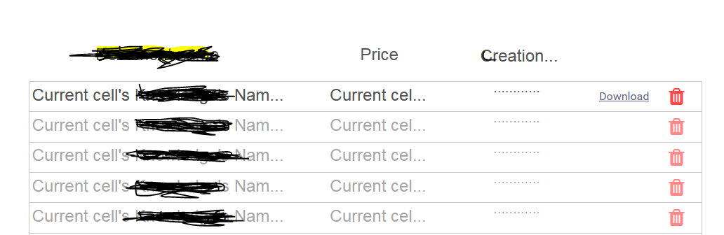
All right guys, I finally find a way to create a kind of column which also can sort your row each time you click on it(s)
So first
Create
A group, where you will put on the top your header (another group) then below your repeating group.
Then you will have something like this:
Then go on "start/edit wordkflow
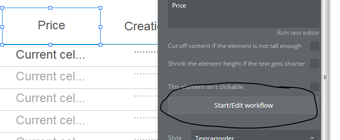
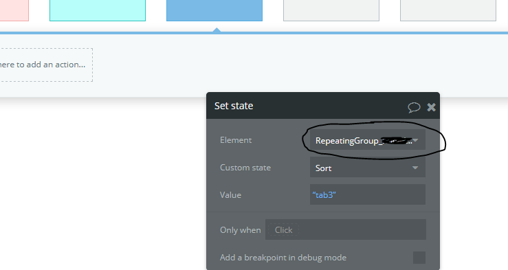
Then Set a State with a custom state I named “Sort” and a value name “Tab1” or “Tab 2” or “Tab3”. It’s really depend of u.
Then you go back to your page and then go on data source: Search for…
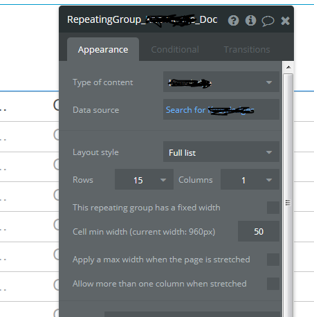
You will have to write your type, and do all the first part. Then add another sort field and follow what I did:
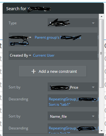
Hope it will help you.
Unfortunately you can’t sort it in both way (Bigger to smaller and smaller to bigger for exemple) but only in one. But it’s better than nothing 
1 Like

I found an easy way to fix the issue. First create a normal group and inside it the repeating group that you want to display and fill it out with text fields. Above the repeating group ( but still in the regular one) write your headers and align them to the left of each item that you want to display. finally make both groups left and right borders coincide and make them both fixed width
I know this question is old, but I want to share how I do it with the responsive engine because I’ve not seen it here as a solution.
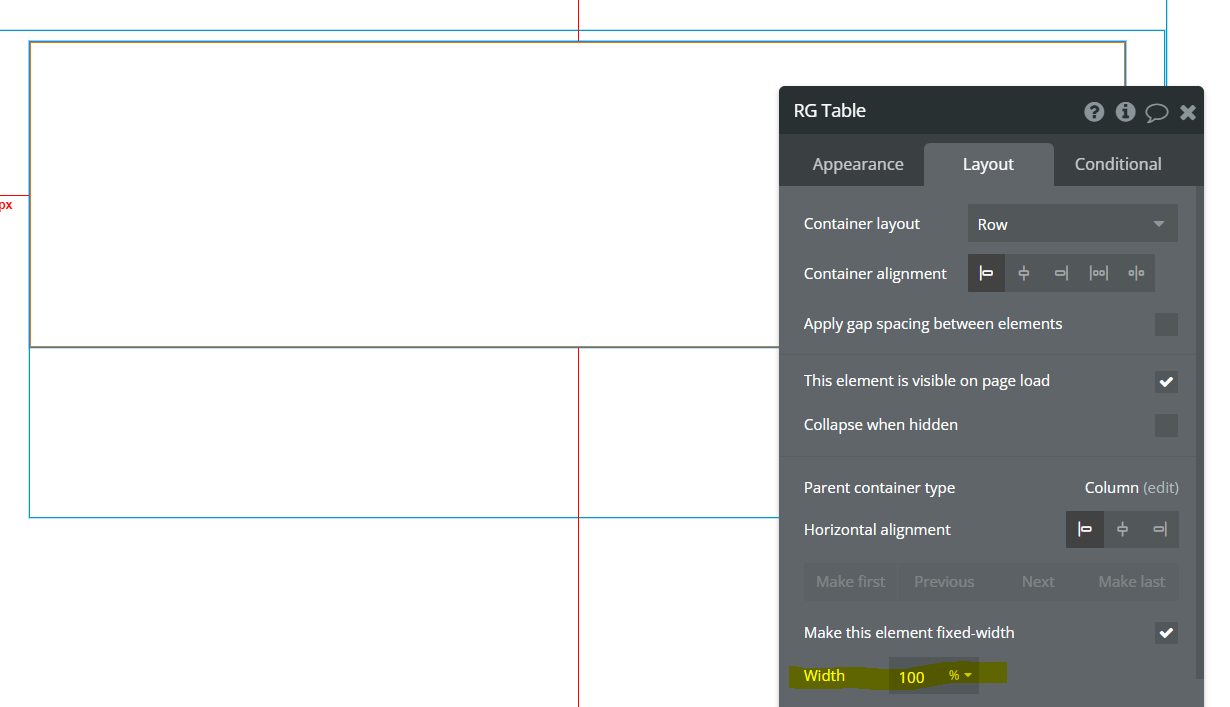
Step 1) Make a parent group that’s the size you want your RG to be
Step 2) Make a 1 column RG and put it in the parent group you just created. The parent has a column layout, the RG has a row layout.
Set the RG to be 100% fixed-width (AKA size of the parent)
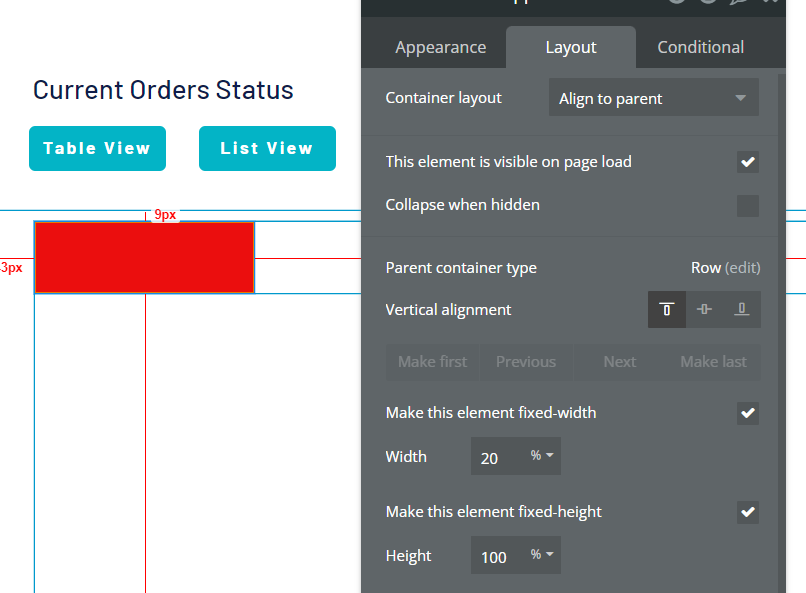
Step 3) Make a headers group row and put it on top of the RG and make it 100% fixed with of the parent too.

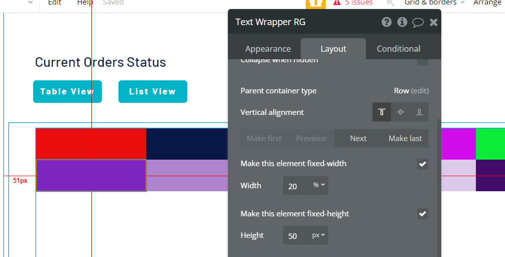
Step 4) Write out your headers — but wrap each in a group. These wrapper groups always take up the same amount of space. Divide the number of columns you want by 100 and make each header wapper column that wide as a fixed-width percentage. For 5 columns make each 20% wide. Set the wrappers to align to the parent and make them 100% height too.
Step 5) Make wrappers in your RG that are the same percentage width and height as your header wrappers.
Now they should stay the same size as the page resizes.
If the columns need to change you can make the titles dynamic from the database and conditionally check if a column name exists in the RG.
1 Like