I have no idea why. At first I thought that the hidden Menu Item group was the culprit but it has a fixed width of 340px so if that was doing the pushing it should start pushing it off much earlier.
You have “group | texts | group” on that header. Perhaps it could help to have “group | group | group”. If that header is a group (and not a floating group), then check for the responsive settings of its parents as well. That may be causing the push off the screen.
Lastly … seeing that you are vested deep in your project, you may want to consider getting an interesting and fresh take on responsiveness that cannot be found easily online. @gregoryjohn just did an awesome workshop that I believe anybody wanting to manage responsiveness well in Bubble, should watch. It is a long watch … but I for one found it very valuable > How To Do Responsive Design in Bubble with Gregory John
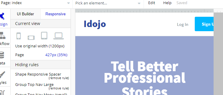
@cmarchan, thanks so much for the quick reply. It was the parent’s (Group Top Nav Small) parent (Group Top Nav) minimum width that was pushing that group off the screen. I checked the parent but forgot to check the parent’s parent.
Now I feel like an idiot for missing that but still glad I asked the question. Probably would have taken me another few hours to figure that out on my own.