Hey Bubblers, just published a Custom Toggle plugin — it includes many of ways to customize your toggle input that currently aren’t available in other toggle plugins:
Set the Toggle color (when set to “no” and when set to “yes” to exact Hex/RGBA color)
Set the Toggle corner roundness
Set the Toggle Handle roundness
Set the Toggle height and width in pixels
Set the Handle color (to exact Hex/RGBA color)
Set the transition time (for the handle to move from left-right, and the color to change)
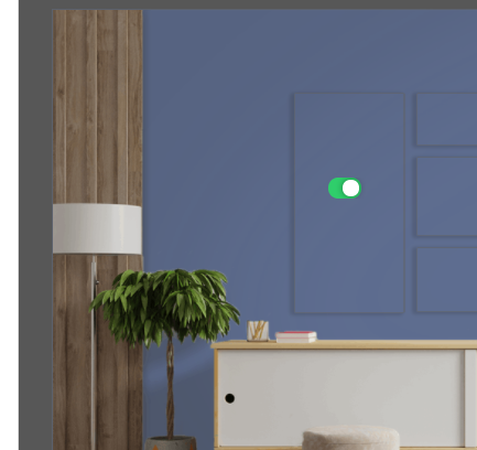
Hi Bubblers, just pushed an update to the toggles plugin so that you can customize the width of your toggle handle. This can be helpful if you want to add text or icons above your toggles so that users know what it means when the toggle is on or off.
Here is an example of this implemented for an “All Calls” vs. “Missed Calls” toggle:
Let me know if you have any questions!
Alex TechBlocks
Unfortunately your toggles, beautiful as they are, are fatally buggy.
Having several rows of them to turn a list of notifications on or off has unreliable behaviour. It can even go back on quickly, trigger several backend APIs, etc.
It seems one has to wait for the animation to complete for it to work… sometimes.
I took a look at the issue and believe I’ve found the cause: the handle didn’t move when the dynamic value of the toggle changed from “Yes” to “No”. I’ve pushed a fix for this issue to address this bug and it should now be working properly. Please update the plugin and let me know if you run into any issues! (Let me know if you were actually talking about something else, happy to look further into this)
Hi All, just updated the Custom Toggle plugin. You can now customize the handle shadow color in the Toggle element properties using the “Handle Shadow Color” input:
Not sure if this is the right place for this - I didn’t see anywhere else to go for issues with this plugin.
I just installed your custom toggle plugin. It looks and works great, except:
I set a simple conditional to show/hide the toggle when another element is hovered. However, each time the element is ‘unhovered’ and ‘re-hovered’ the toggle reverts to its default state. This happens when the default is “yes” or “no.” Here’s a quick screen cam of what’s happening: Toggle behavior on hover
Changing the button roundness (from the 500 default) has no effect on the toggle’s appearance.
@jonpatrick65 looks like you have it set to 200. Try “0” if you want no rounded edges, or “2” if you want slightly rounded edges. That number is the radius (in pixels) of the corner roundness – meaning if your toggle is less than 400px (2 times 200px radius) you won’t notice any difference.
Thank Alex. I just assumed that everything was probably calibrated from the pre-populated number – without ever giving a thought to what that number might actually represent! As you can tell, I’m learning.
Hello Alex!
I bought this plugin, a very nice toggle indeed. Though, I have a question: in your demo page there is an example toggle with ‘all calls’ and ‘missed calls’. I’m trying to do the same thing but can’t manage so far. I understand that you create an additional group, which is above the toggle and the texts, and when a user clicks on it, it changes the toggle’s value. But for some reason I couldn’t place that group so that it would be above everything - it clicks the toggle itself somehow. Do you have any secret?