Hello,
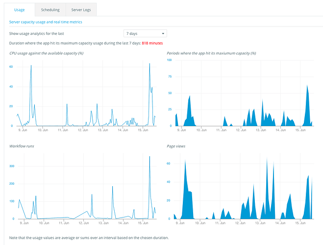
We’ve just pushed a change that will show more charts in your Logs Tab. In particular, we’re showing how much capacity your app consumes, and how much it’s being rate limited when it’s hitting the limit.
We’re doing this so that you can understand changes of performance you can see in your app, as usually these changes are causes by a higher traffic or activity in the app (the page views and the workflow runs are useful to see some correlation).
This is related to this earlier post. We’re currently working on letting people buy more capacity for their apps, but this is a major infrastructure project. We should be able to do this in the next few weeks.
This does not apply to users on a Dedicated Plan, as they’re not sharing their infrastructure with other apps, and have their own dashboard showing the health of their servers.
6 Likes
currently, mine says this:
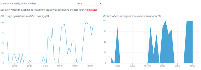
But what does it mean? The app hitting maximum capacity means it’s speed is being capped in those instances? Or does it mean something can stop working at 100% capacity (like the API workflows we talked about)?
edit:
I guess setting it to ‘hour’ is not very reliable because now it says:
This means your app is waiting for some time and is on hold, waiting for another process triggered by your app to complete.
This looks like a great addition. Curious how exactly to use it though.
Example, I noticed in my application that I have hit Maximum Capacity over 2 hours in the past 3 days, yet when looking at CPU usage, it is never higher than 6%, and when looking at “Periods where the app hit its max capacity” it never exceeds 25%.
So I guess, what exactly is maximum capacity?
As one of my apps apparently gets to 100% and another only 25%, yet both have record some duration at max capacity
Is the goal to get “Duration where app hits max capacity” to as close to zero as possible? Is zero possible?
Hello,
This is because the CPU usage you’re seeing is averaged over a period of time. So you never exceeded 25% over the period of 2 hours, but there can have been (in fact there has been) a few minutes where you were at 100%.
I don’t know if the goal is to be at 0, but for people that want higher performance, it’s a good metric to track, yet. We’re working on letting people buy additional capacity but it’s a major project.
2 Likes
Good to know the numbers shown are averages over that period of time. It wasn’t obvious to me either.
Useful information to have. Thanks.
2 potential UX tweaks - It might be helpful to update the chart title to something like “Average CPU usage…” and, if your charting library makes it easy the show the chart as a bar chart instead of a line chart, then do so since that’d more effectively convey to users that it’s a 2 hour average and not, in fact, a continuous value.
1 longer-term UX idea - of course, if you wanted to get fancy, you could also show an upper 10% and upper 1% value to help tease out the upper portion of the distribution, but that’s likely a bit overkill for today.
2 Likes
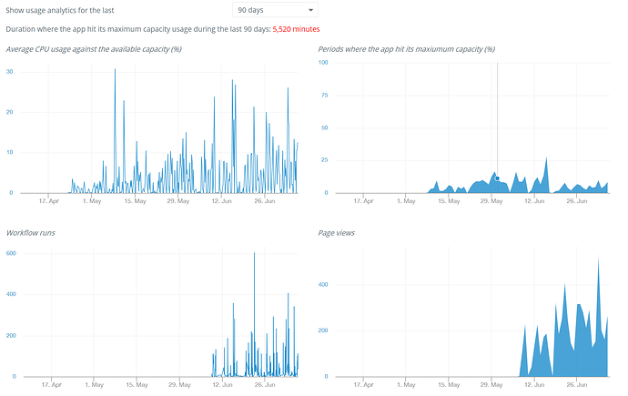
Now that this is implemented for some time, would others care to share their usage so we (I  ) can compare our app’s performance to an average?
This is our average for 90 days:
2 Likes


