I have a repeating group that I want to allow to stretch as the page increases in width and to shrink as the page decreases width…this works fine, however I can’t find a way to get the margins within the repeating group to remain the same so that the elements inside of the repeating group cell stay aligned correctly.
I understand that the repeating group is set to not have a fixed width which is needed to allow it to stretch, but couldn’t there be a way to indicate not to stretch the width or reduce the width of the repeating group unless all cells could be displayed with same margins as originally set?
What I am trying to do is avoid having to create separate groups for different screen sizes and instead allow the responsive settings resize things.
The short answer is not like you want. I see your cards are fixed width. If you let them out the margins will be fixed. But then your card doesn’t look quite like you want does it…
My favorite responsive mode has been to adjust element height and let the cards get as wide as necessary. That way I keep my margins. Looks good on most screens.
@duke.severn thanks for the reply. I like the video you posted as the display is very nice.
Could you provide an editor link to a demo app to showcase how you created that, or a bit more written instruction on how you have the element height adjusting?
Once I get it figured out I will post a tip and tag you for credit to help future bubblers who have the same issues with repeating group responsiveness.
Yes. What I have is no max width, a min width of 99% and the image is set to “keep element proportions as element is resized”. Sorry that’s what I meant by adjust element height. Then Put a group with your text over top. Should work. If not send me what you have and I’ll take a look.
@duke.severn Thanks for the tips. I have been able to get the margins to remain the same distance by having the cells expand with no max width and a min width of 99%.
I am having issues with the text elements remaining in place, both when the page expands and when the page is at a particular width that sets the elements to 99%.
This is how it looks when it is at 100% width of the original settings.
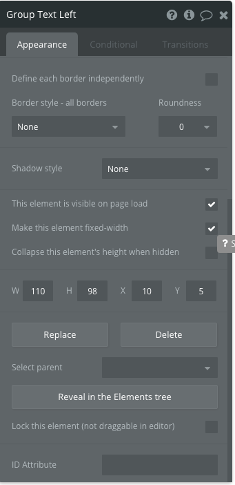
I have the text elements and others in a group that provides a dark background color when the image is hovered so that the white text is clear. This group is set up as below:
I am assuming the issue with the text on left not getting the same positioning in the shade group is because as the shade group expands its width with the page, the dimensions are not recorded as changed, which would make it so the left side text group is still at the original X coordinate.
How would you suggest changing the settings to get the text to remain aligned to the left and right of the group consistently?
@duke.severn I got a new issue now as I continue to progress on this portion of the app.
I have set things up so that the repeating group has no fixed width and when the page expands and shrinks the repeating group follows suit perfectly.
The new issue is that I am wanting to use pagination on the page. I have the repeating group set to show the search results. When I design the page the pagination group is at a certain Y coordinate, which is set accordingly to be relative to the repeating groups page position.
As the page expands and the repeating group shows fewer rows because the columns expand the number or results, the entire repeating groups height becomes shorter, causing a large gap between the pagination group and the bottom of the repeating group since there are more results on each row.
What is more I am suspecting that the footer will have similar issue.
I am curious how you managed to deal with such an issue.
In my mind there are a few avenues to take, none of which would be quick. My first thought was to set a conditional for the page height to change when the page width is a certain width, but that is not possible.
Now thinking of how to do this, I can’t really think of anything that would work well. The only thing I can actually think to do is set a max width of 100%, but that is not ideal as the idea of how I’d like to display the results in the repeating group was a full page view, regardless of page width.
It is, it was also my first thought and this is how I did it:
Find your breakpoints in px in any emulator. Check a few, I got lucky and had the same breakpoints on Ffox and Chrome. By breakpoint I mean at what width the RG changes the number of visible cells. You’ll likely have a few (I had 6 between 320 and 1080. If I remember I max widthed at 1100)
Get toolbox plugin by mishav. Place a javascript to bubble element on your page. Get the
$(window).width() and set up a number for your javascript to bubble. Do the math to figure out how many items you want in your pagination at this screen size (we’ll call this maxnum). You should also write a window.resize function to refresh it (I didn’t do it, it caused problems).
Place your RG’s data source in a state (we’ll call this master list). Make an index state, default 1. Use items until maxnum if index is 1. If index is bigger than 1, call a custom function.
In custom function do index=index+1. Do masterlist items until maxnum * index merged with masterlist items until maxnum*(index-1):unique elements. That’s your new page’s elements. Display that in the RG. Should work forward and backward.
I’d show you an example, I’m pretty sure I had it working except for the window.resize. But law of parsimony and reading an article about UX that explained when to use pagination vs. when to use what bubble calls Ext. Vert. scrolling, I changed my mind and went with ext.vert. scrolling.
@boston85719 interesting approach. Did you managed to remove the gap between pagination and the (fixed number of cells) repeating group records, when less records are shown on the last page. If so how did you do it?
@FJP I am not sure exactly what gap you are referring to…maybe the design of the page wasn’t polished and finished, but remember the repeating group will expand and contract when the number of records changes, which will automatically push the pagination group down or pull up as bubble will keep the margins fixed.
I am actually working on improving this repeating group design as it doesn’t provide me with the effects I want due to resizing issues when page is expanded etc. I am anticipating providing users with an option to change the view size so the content size will change based on users choice as well as changing the number of results displayed on the page.
Let me know how you get on with things in a week or so and if you need some help and I have figured out how to make the repeating group responsive design better I will shed light onto what I will have done.